7. Branda
This guide explains how Branda simplifies white labeling, rebranding, maintenance pages, and even email. Use the Index on the left to quickly locate usage guidance on specific features.
If you haven’t installed Branda yet, then you should visit the Branda page where you can explore the plugin’s many features, and where WPMU Dev members can install Branda directly to any connected site.
Note that if you’re running a multisite install, all settings you adjust in any active modules will apply to all sites in your network by default. But you can override that and allow subsite admins to configure any modules on their own subsites their own way. See Subsite Controls for details.
Every WPMU DEV hosted site comes fully loaded with Pro versions of the following plugins automatically installed for you: Smush, Hummingbird, Defender, SmartCrawl, and Forminator. Not hosting with us yet? Check out our Hosting page to see if we might be a good fit for your projects.
Please note that Branda does not natively support SVG images in any of its modules. If you need to use the SVG format for images in any Branda modules, you will need to install a 3rd-party plugin to first upload and manage those images. There are a few good free plugins for that available at wordpress.org, for example: Safe SVG or SVG Support.
7.1 Dashboard
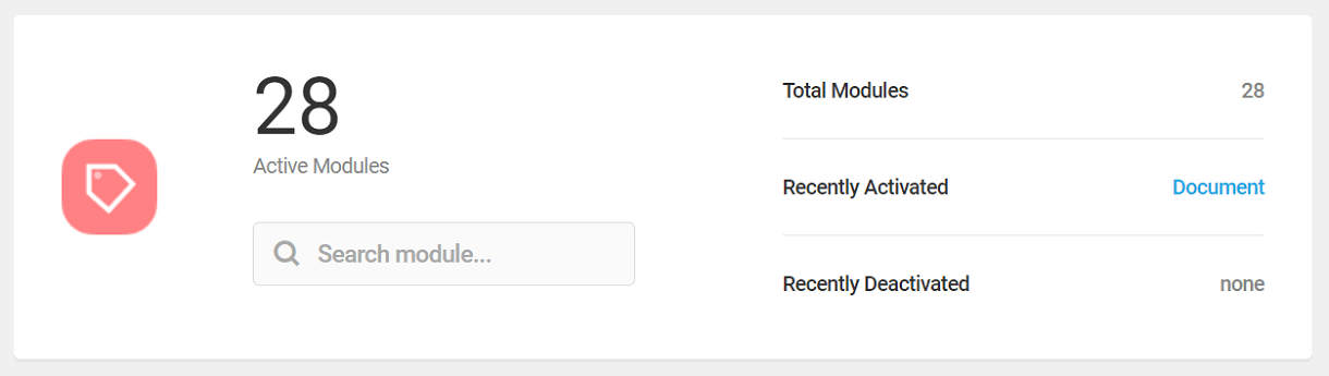
Copy chapter anchor to clipboardThe Branda Dashboard allows you to access every module from one screen.
Branda’s modules are organized into five functional groups:
If you’re on the lookout for more tips and tricks to make Branda your new best friend, look no further than our blog on how to Get the Most Out of Branda.
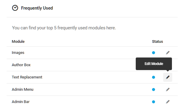
To access a specific module from the dashboard, locate the module’s functional group, and click the Edit Module link on the right. The module’s activation and configuration settings will appear, along with links to other modules within the same functional group. A status indicator next to each module will be blue if a module is active and clear if it is not.
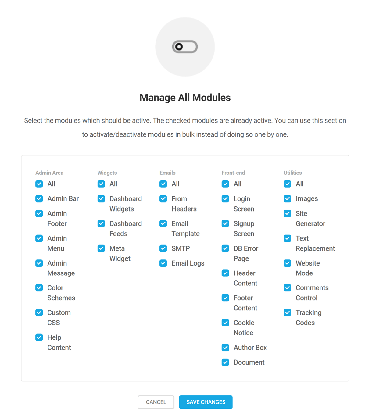
Click the Manage All Modules button at the top of the Branda Dashboard screen to access a bulk action feature that allows you to activate or deactivate any or all modules from one screen.
Select All at the top of each column to select or deselect all the modules in that functional group, or click the boxes next to individual modules to select/deselect them. Click the Save Changes button to enact your changes.
View Documentation
Click the View Documentation button to access this Branda user guide any time you need it.
Search
Use the search option to quickly locate individual modules from any of the five functional groups.

7.2 Admin Area
Copy chapter anchor to clipboardThe Admin Area group includes modules that enable you to customize pretty much everything in the admin area of your site.
Our blog on how to Completely Customize The WordPress Admin Area With Branda shows you just how easy it is to fully personalize your Admin Area with our Branda plugin.
7.2.1 Admin Bar
Link to chapter 2The Admin Bar module allows you to customize the admin bar logo, to create custom menus, to show or hide menus based on user roles and to reorder the admin bar menus.
Are you interested in completely transforming your multisite network admin area? Check out our blog, Customize Your WordPress Multisite Admin Areas, to learn how to use Branda’s powerful tools on your multisite.
Click the Activate button to proceed.

Logo
Replace the default WordPress logo in the admin bar with your own by clicking the Upload Image button and selecting an image from your media library or by uploading one from your computer. The new logo will appear in the toolbar on every page of the admin area and will link to the About WordPress menu.
Toolbar Visibility
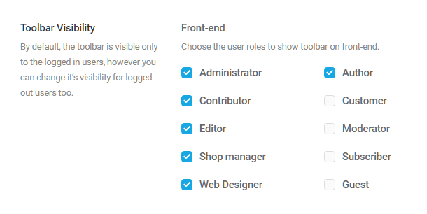
By default, the admin toolbar is visible only to logged-in users, but you can make your custom admin bar menus available to logged out users. The default WordPress menus, such as My Sites, Comments, Updates, etc., will not display to logged out users, but if you enable logged out visibility, your custom menus will. Any custom menu item that links to a site admin page will require users to log in before redirecting them to the intended page.
Select the user roles who should see the toolbar on the frontend, then click Save Changes.
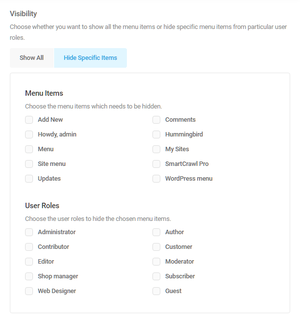
Menu Items
Customize the Admin Bar menu by hiding menus, reordering them, or by adding your own custom menus. You can also choose what menus are visible to users based on their roles.
By default, all menus in the admin bar are in the “Show All” state, meaning all menus are visible to all users. You can hide a menu from all users, such as a default WordPress menu, or customize the menus available to each user. To do so, click the Hide Specific Items button.

Visibility
Select the menus you wish to hide, and then select which user roles should not see the selected menus. Click the Save Changes button at the top of the module to save your settings.
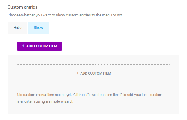
Custom Entries
You can create multiple custom menus and position them in the toolbar along with the WordPress menus, or remove the WordPress menus and display your menus only. You can also determine which users see which menus. So, if you wish, you can create a unique set of menus that only authors see, another set for admins and so on for each user type. Let’s walk through creating a custom menu.
Click the Show button and then click the Add Custom Item button.
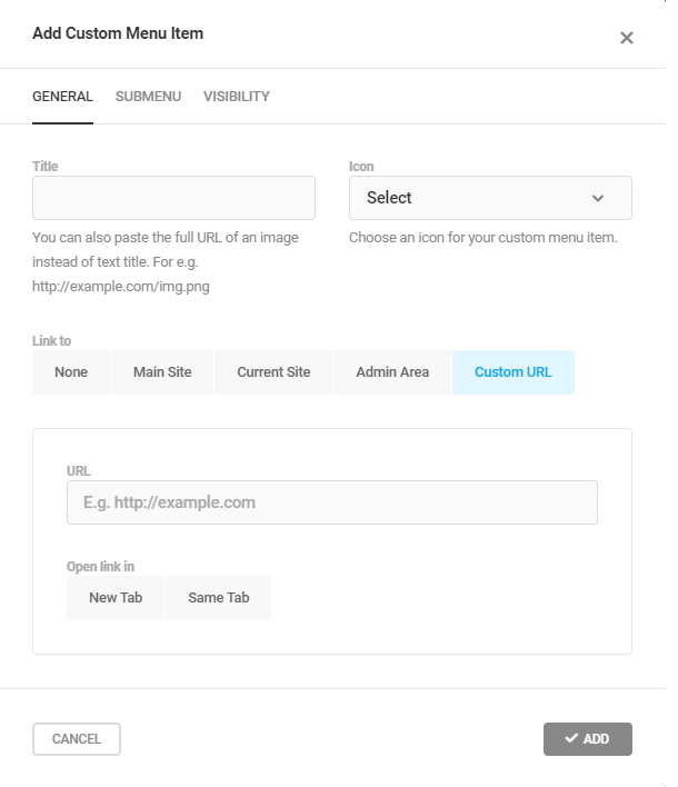
General Tab
Title – You can enter text into the title field or add an image URL if you want the menu represented by an image instead.
Icon – You can select an icon to accompany your menu from more than 200 icons are available in the drop-down menu.
NOTE: It is recommended that you set an icon for each menu main title, because only the menu icon is visible on mobile devices.
Link To – Choose whether the menu will direct users to your network’s main site, the current site, the WP Admin Area, or apply a custom URL. You can also choose to have no link, as might be the case if the title is just a parent label for a list of submenu links.
Open link in – If the menu title is linked, choose whether that link will open in the same tab or in a new one.
Discard Changes – This button will clear all the fields in the General tab.
Update– Click the Update button to save your menu.
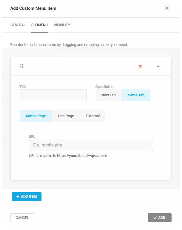
Submenu Tab
Use the Submenu tab to create a multi-level menu. Click the Add Item button, and then click the down arrow to open the options for your submenu item.
Title – Enter the navigation label you want to appear in the menu.
Open link in – Select whether the link will open in the same tab or a new one.
Link to – Choose where the link should direct users. If you choose Admin Page, enter a URL relative to your site’s admin URL. Choose Site Page to link to any page on your site. Choose External to link to another website.
Add Item – Click the +Add Item to add another submenu item. Repeat the steps above, and continue to add submenu items until your menu is complete.
Click the ✔ Add button to add the submenu items to the main menu title you created previously.
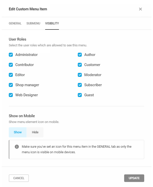
Visibility Tab
By default, custom menus are visible to all users. If you want to hide your custom menu from some user roles, uncheck those roles under the Visibility tab. Click the Show button if you want the menu to be visible on mobile devices (note this option only appears after you’ve initially saved the custom menu). Clicking the Cancel button will clear all selections.
Click the Add/Update button to save your visibility settings.
Reorder Menu Items
Organize the Admin Bar menus to suit your needs by clicking the Reorder Menus button. Click the Restore Default Order button to revert the toolbar menus to their original order.
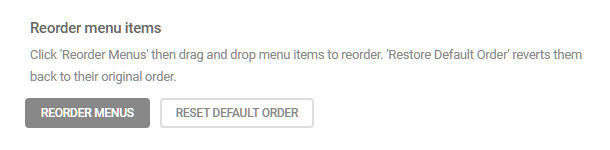
The toolbar menus agitate when the Reorder button is clicked. Drag the menus into your preferred order, and click the Save Changes button.

Custom CSS
Add custom CSS styles to the Admin Bar with this CSS customizer. Use the Admin Bar, Admin Bar Icon, and Menu Item selector buttons to isolate the aspect of the admin bar you wish to customize.

Improve page builder compatibility
If you are experiencing compatibility issues with the Admin Bar feature and your page builder, you can add GET parameters to ensure that Branda does not overwrite the settings on those pages.
Click the here link to pop open a modal window where you can find the parameters you need.
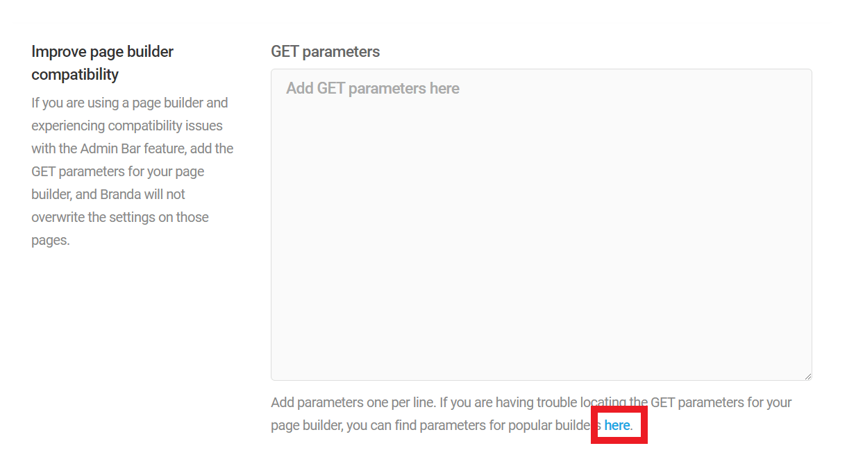
Click in the textarea of the modal window to reveal GET parameters of popular builders, and select the one(s) you need for the page builder(s) you’re using.

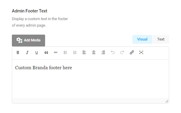
7.2.2 Admin Footer
Link to chapter 2The Admin Footer module allows you to replace the default WordPress footer with your own branded footer. Click Activate to proceed.
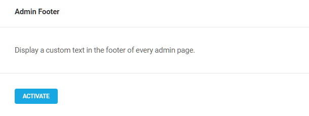
Create your custom admin footer using the post-type editor, and it will display on every admin screen of your site. In a multisite, it will display on every admin screen in every site of the network.
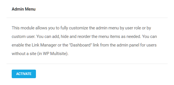
7.2.3 Admin Menu
Link to chapter 2The Admin Menu module allows you to fully customize the admin menu by user role or by custom user. You can add, hide and reorder the menu items as needed. You can also enable the Link Manager or the Dashboard link from the admin panel for users without a site (in WP Multisite).
Click Activate to proceed.
Once activated, you’ll see this module contains a few sub-modules:
- Custom Admin menu
- Dashboard Link (multisite only)
- Link Manager
- Admin Tips

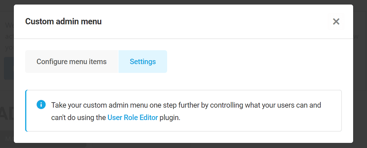
Custom Admin menu
The Custom Admin menu option enables you to fully customize the admin sidebar menu for selected user roles or even specific users.
These options can only be used to limit the access capabilities per user or per user role. Branda cannot increase the capabilities of a user or user role. To do that, you’d want to use a plugin like User Role Editor. You can then limit the access to specific menu elements if needed here.
Click the Customize button to pop open a modal with all its options.
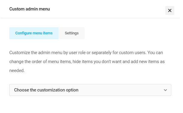
Configure menu items
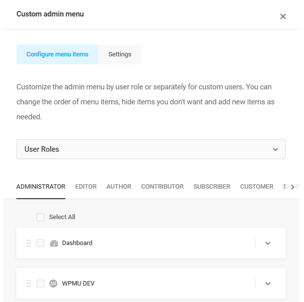
First, select whether you want to customize the menu for user roles or specific users in the dropdown menu. Note that any customizations you make here for specific users will override customizations made for the corresponding user roles. All default WordPress roles will be available for customization here, as well as any custom roles added by plugins.
At the bottom of the modal are options to Apply your changes, or Discard all changes for the current editing session. Note that if you accidentally close the modal before clicking the Apply button, your edits will still be there when you re-open the modal as long as you haven’t navigated away from this Branda screen. So it’s a good idea to remember to click Apply as you go so you don’t lose your work.
To customize the menu for any user role, first click the user role you want in the top row. The list of menu items below will refresh and automatically populate with the admin menu items that user role has access to by default.
Note that you can only edit the admin menu for roles equal to or lower than the role of the user you are currently logged-in as. In other words, if you have granted access permissions to the Editor role in Branda > Settings > Permissions, an Editor user will only be able to edit the admin menu items for the Editor or lower roles; an Editor user will not be able to edit the admin menu for higher roles, like Administrator.
You can drag and drop the top-level menu items to re-order them any way you like, but you cannot move a top-level menu item into the submenu of another. If you need to move a top-level menu item into the submenu of another, you would need to manually re-create that as a new submenu item in the other one, then hide the original.
Hover your cursor over any menu item to reveal the following options. You can also select multiple items by checking the boxes to reveal the same options at the top of the list that can be enabled in bulk.
- Duplicate – Creates an exact duplicate of the menu item, including its sub-menu, that you can edit & customize.
- Hide but allow access – Hides the item in the admin menu, but allows direct access if the URL is known. When set, an Unhide option will appear on the menu item instead.
- Hide and disable access – Hides the item in the admin menu and prevents direct access if the URL is known. When set, an Unhide option will appear on the menu item instead.
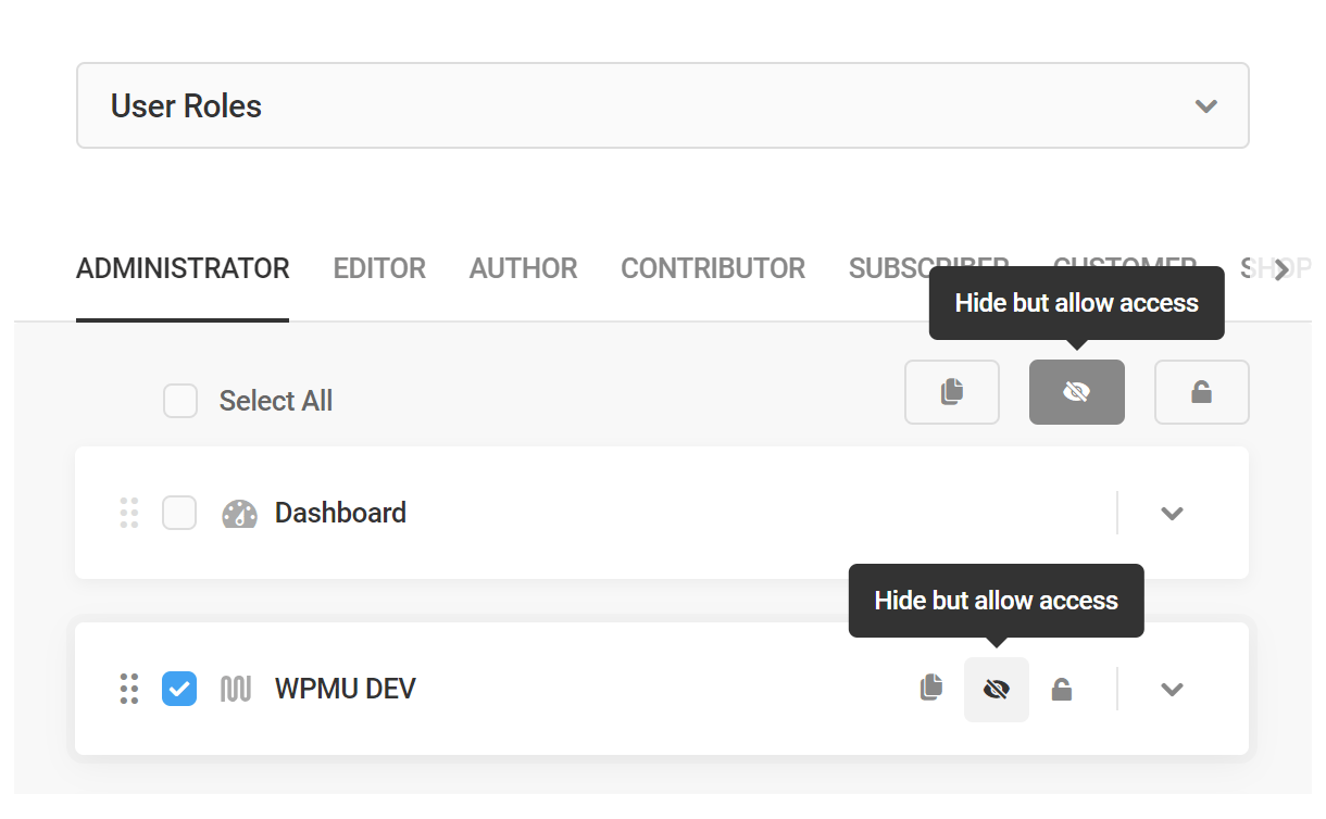
Click the down caret on the right to reveal additional options for any menu item.

Under the Settings tab, you can customize the top-level menu item label, its CSS ID & classes, as well as its icon and where it links to.
Note that if you’re linking to a page in the wp-admin, you can enter just the page slug; the domain-specific wp-admin URI will be added automatically. This can be very handy if you’re setting things up on one site and exporting the configuration to another site.
Under the Submenu tab, you can drag and drop the submenu items to re-order them, as well as edit the same settings as the top-level menu item.
Note that while there is a “None” option for every menu item’s icon, it is recommended to use icons for all menu items as that’s all that appears on mobile devices.
To add your own custom top-level menu item, click the + Add Item button at the bottom of the modal, and adjust the settings in the same way as above.
Click the Submenu tab to add a submenu to your custom top-level menu item if you need one. You can also add custom sub-menu items to existing top-level menu items in the same way.

To edit the menu for a specific user, select Custom Users in the dropdown at the top of the modal. Then use the search field to find the user you want to edit the menu for. You’ll then see that user appear in the top row instead of user roles.
Customize the menu for that user in the same manner as above, and once again, remember that any customization you make for a user will override customizations made for that user’s role. In other words, you can set up a customized menu for a user role, then override that for specific users with that same role.

Remember to click the Apply button at the bottom of the modal to save your customizations.
Settings
The Settings tab allows you to further customize what your users can and can’t do by using the User Role Editor plugin.
Dashboard Link
This option appears only in multisite and allows you to remove the Dashboard link from the admin for any users that do not have a subsite. This way, the only admin screen they can access is their Profile screen in the main site admin.

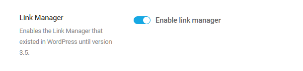
Link Manager
Branda allows you to restore the WordPress Links Manager that was removed from the admin menu with WordPress version 3.5. The links manager allows you to add, modify, or remove links without having to manually modify the HTML source code.
Click the Enable link manager button to re-enable the link manager. This also re-enables the blogroll widget under Appearance > Widgets that you can add to any widgetized area on your site to display your links.
When enabled, the link manager will once again be available on your site under the “Links” menu item in the admin menu for each site in your network. Click the Links menu item to view the options where you can create & manage your blogroll links.
Admin Tips
The Admin Tips option allows you to display custom messages at the top of any admin screen in your site or network.
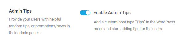
This option creates a new post type on your site that displays only in the admin area of your site: Tips. Once the option is enabled, you’ll see a new “Tips” menu item appear in the admin menu.
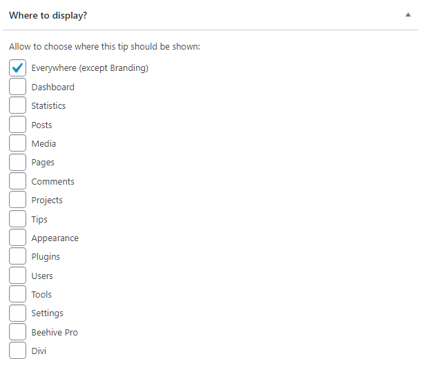
Create and edit your admin tips with the WYSIWYG editor just like any other post. In the Tips editor sidebar, you’ll see a metabox to customize where your admin tip should appear. Branda recognizes all plugin menus as well, and this section will give you options to enable your tips on the admin screens of any active plugin you have installed.
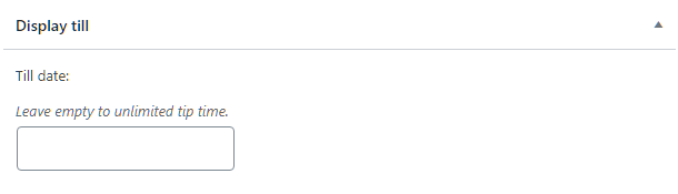
You can also set an optional expiry date for the tip so it will automatically disappear from view on that date.
7.2.4 Admin Message
Link to chapter 2The Admin Message module allows you to display a custom message on all your admin pages. Click Activate to proceed.

Use the post -type editor to create your custom message. Click the Save Changes button at the top of the module to save your message.

Your custom message will appear at the top of every site’s admin page until it is removed.

7.2.5 Color Schemes
Link to chapter 2The Color Schemes module allows you to control which admin panel color schemes will be available to users and set the default color scheme for new users. Click Activate to proceed.

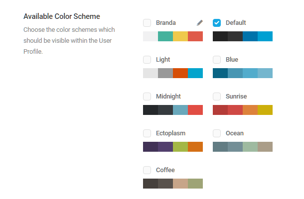
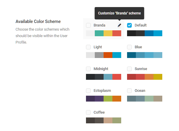
Available Color Scheme
Branda provides several color schemes which can be selectively made available to users and one fully customizable color scheme with the default name “Branda”. Click the Save Changes button at the top of the module to save your changes. A brief guide to customizing the “Branda” color scheme is below.
Click the checkbox next to any color scheme you want to make available to users. At least one scheme is required, although multiple schemes can be selected.
Creating a custom scheme
Click the pencil icon in the Branda Scheme to pop open the Edit Color Scheme modal.
Edit Color Scheme
Use the Edit Color Scheme panel to create a custom color scheme for the admin sections of your main site and every site in your network.
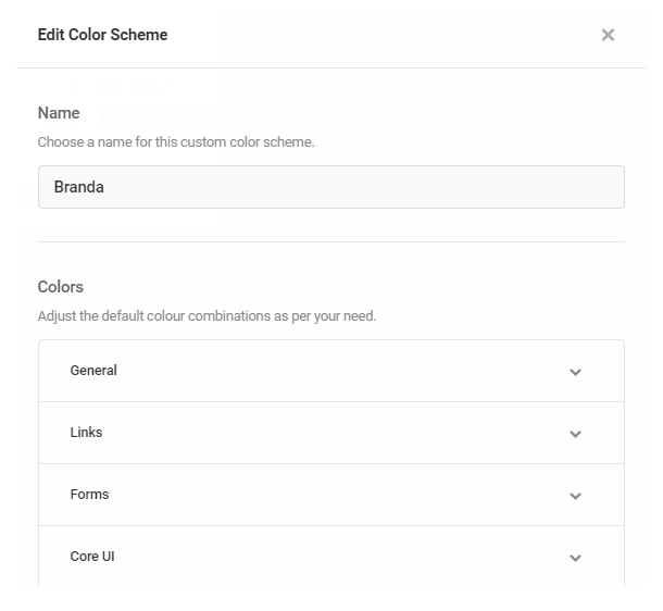
When using the color pickers to customize your color scheme, click the color swatch on the left and choose a color from the palette, or enter a color hex code into the field provided. Click the Update button at the bottom of the modal to save your changes.
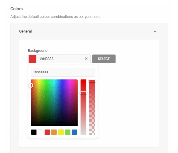
General – Use the color picker to the choose a background color for the Admin Area.
Links – Use the color picker to choose the colors used to highlight the links on your sites. The default color will display on all functional links except those specifically assigned a unique color. The Delete/Trash/Spam and the Inactive plugin color will display on the corresponding types of links. Under the Hover tab, you can choose the color of links being hovered by a cursor.

Forms – Use the color picker to choose the color displayed when checkbox and radio buttons are enabled.
Core UI – Use the color picker to choose the color of all CORE UI buttons and button text. Under the Hover tab, you can choose the color of buttons being hovered by a cursor.
List Tables – Customize the colors of certain table elements, including the View Switch icon, the post comment count, and the color of alternating rows. Under the Hover tab, you can choose the color displayed when these elements are hovered by a cursor.
Admin Menu – Customize the static and interactive colors of the Admin Menu. All links in the default state will display the Static color. Choose colors for the Hover, Current, Current Hover, and Focus options to customize how Admin Menu links behave when interacted with.
Admin Bar – Similar to the Admin Menu above, links in their default state will display the Static color. Choose colors for the Hover, Current, Current Hover, and Focus options to customize how Admin Bar links behave when interacted with.
Media Uploader – Use the color picker to choose the colors of the elements of the media uploader panel.
Click the Update button to save your custom palette.
Default Color Scheme
Use the drop-down menu to choose the default admin color scheme for new users. New users will be able to customize their admin color scheme whenever they wish unless you enable the Force Color Scheme option.

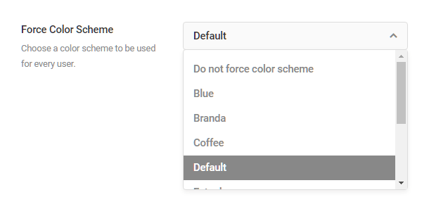
Force Color Scheme
Use the drop-down menu to force use a color scheme for all users that only network administrators can change.
7.2.6 Custom CSS
Link to chapter 2The Custom CSS module allows you to add custom CSS to the header of every admin page.

Use the CSS editor to edit the header stylesheet. Selector buttons are provided for some of the most common admin elements, but you can of course add any custom CSS here that would apply to the admin area only.
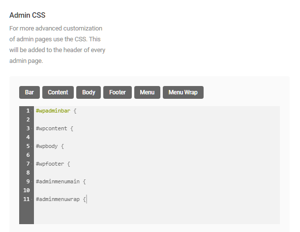
- Bar – Applies custom CSS to the display properties of the admin bar
- Content – Applies custom CSS to the dashboard container
- Body – Applies custom CSS to elements within the dashboard container
- Footer – Applies custom CSS to the footer displayed on the admin pages
- Menu – Applies custom CSS to the main Admin Menu located on the left of all admin pages
- Menu Wrap – Applies custom CSS to the main Admin Menu wrapper
Click the Save Changes button to save your custom CSS.
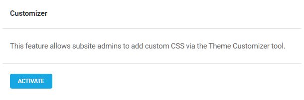
7.2.7 Customizer
Link to chapter 2In multisite installs, the Additional CSS section is disabled by default in the Theme Customizer for all user roles except superadmins.
When activated, this module enables the Additional CSS section in the Customizer for subsite admin users.
7.2.8 Help Content
Link to chapter 2The Help Content module allows you to change the existing help content shown by WordPress when you click the “Help” tab at the top-right of any admin screen. You can also add new help items, and/or add a sidebar to the help content. Click Activate to proceed.

Help Items
Click the Add Help Item button to begin creating a custom help menu.
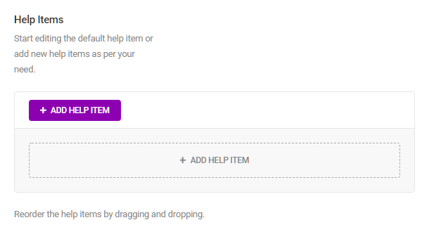
Create your custom help item in the post-like editor, add media if you wish, and click the Add button to save. Repeat the process to create multiple help items.

Menu items can be reordered after they are created by dragging and dropping the menu blocks.

Help Sidebar
Add a sidebar within your custom help content with this editor. Enter the sidebar text and add media and links as desired. The sidebar will not appear if no content is added.

Your custom help content can be accessed by clicking the Help drop-down menu in the top-right corner of every admin page.

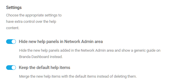
Settings
In multisite installs, click the Hide new help panels in Network Admin area button to prevent your custom help items from appearing in the network admin.
Click the Keep the default help items button if you wish to merge your custom help menu with the default WordPress admin help menu, otherwise, the default menu items will not appear.
7.3 Emails
Copy chapter anchor to clipboardThe Email Module will help you stop sending “text only” system emails from your website, and allows you to send SMTP emails, which greatly reduces your email rejection rate.
7.3.1 From Headers
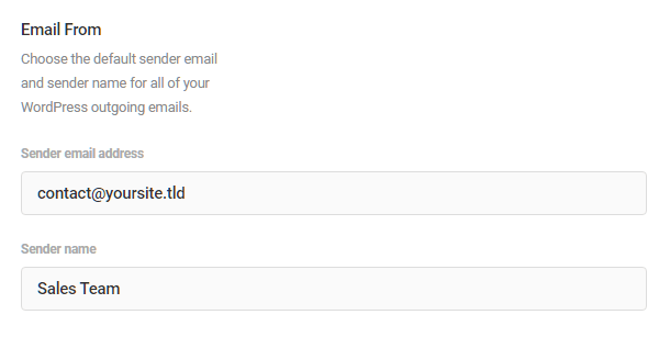
Link to chapter 3Email From
The “Email From” settings determine the default email address for all of your site’s outgoing emails, as well as the sender name that appears in those emails. By default, WordPress uses the address and display name of the admin email you have entered in your site’s Settings > General.
To change that, enter the email address and sender name you prefer in the fields provided, and click the Save Changes button.
Reply to
The “Reply to” settings are the email address and name where replies from the email recipient will be sent. These can be the same as the “Email From” settings above, but you may wish replies sent to an email set up specifically to receive them. In that case, enter the email address & name in the fields provided, and click the Save Changes button.
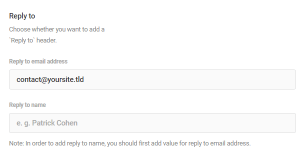
These settings cannot override the from headers for transactional emails sent from sites hosted by WPMU DEV. If you wish to customize the from headers on WPMU DEV hosted sites, you’ll need to set up SMTP instead.
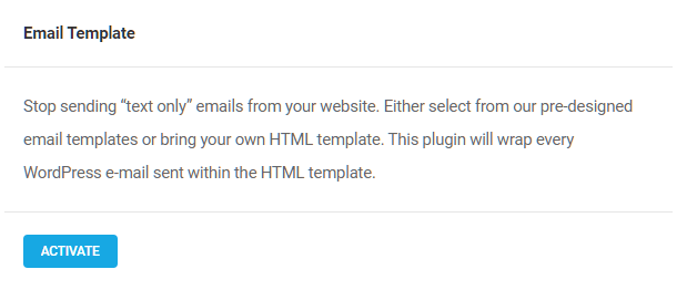
7.3.2 Email Template
Link to chapter 3This module enables you to create an HTML template that will be used to wrap every email sent from your site. Click the Activate button to proceed.
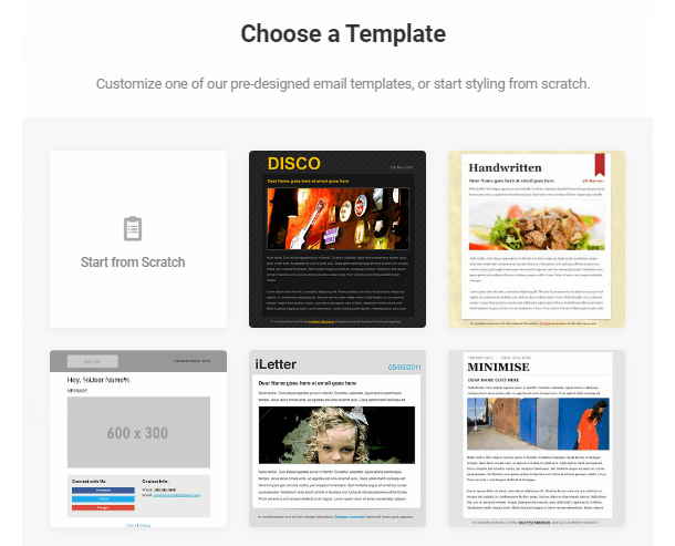
Choose a template
The first time you activate the Email module, you will be prompted to choose an email template. Select a template, or select Start from Scratch if you want to build your own template, and then click Continue. You can change your template choice at any time by clicking the Choose a Template button.
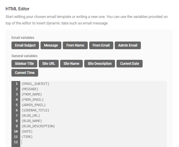
HTML Editor
Use the HTML editor to customize your chosen email template or create one from scratch. You can use the variable buttons provided to insert dynamic data into your template.
Email Subject – This identifies the title of the email.
Message – This identifies the message content of the email.
From Name – This is the name that appears in the From field of your system emails.
From Email – This is the email address from which your system emails are sent.
Admin Email – This is the administrative email address to which you want email-related notifications sent.
Sidebar Title – If your email template includes a sidebar, this is the title you wish to display in that sidebar.
Blog URL – Presumably, this is the URL of the website sending the email, although you can enter any URL you wish.
Blog Name – The name of the sending blog or website.
Blog Description – The site description you want included in the email.
Date – The date appearing in the content of the email.
Time – The time appearing in the content of the email.
7.3.3 Registration Emails (Multisite Only)
Link to chapter 3The MultiSite Registration Email module allows you to customize email notifications generated when new users and new sites are added to your network. Click Activate to proceed.

You must enable user and/or site registration in Network Settings before you can create your custom email notifications. Attempting to do otherwise will trigger the error messages below. Both messages contain a link to your Network Settings. Once user and/or site registration are enabled, return to and refresh this page, and then you can begin configuring your custom email notifications. It is also recommended that you configure your SMTP credentials before sending emails.
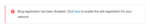
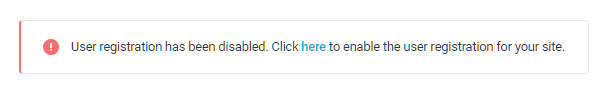
In your network admin Settings > Network Settings, select any option at “Allow new registrations” except “Registration is disabled” according to your needs.

With new user and/or site registration enabled, you can now configure the Multisite Email Registration module.
Note the presence of PHP variables in the subject line and email body of each of the three emails available for customization: [%1$s] and %2$s and %s. While you can of course move them around in your custom emails, it is recommended to leave them in the emails as they are required for the following:
- [%1$s] works in the subject line only and will be replaced by whatever you have set for the Network Title in your network settings.
- %2$s works in the subject line only and will be replaced by the site name or username.
- %s works in the email body only and will be replaced by the links needed for the user to activate their new site or username.
New Blog
To customize the email generated when a new blog is published, click the button enabling Customize new blog notification email. If you want, you can replace the word “Activate” with a custom subject line, but do not edit the php variables.
Likewise, you can change the text in the Email Body field to whatever you prefer, but do not edit the existing php variables.
Click Reset if you want to return the customization fields to their default states after saving any changes.

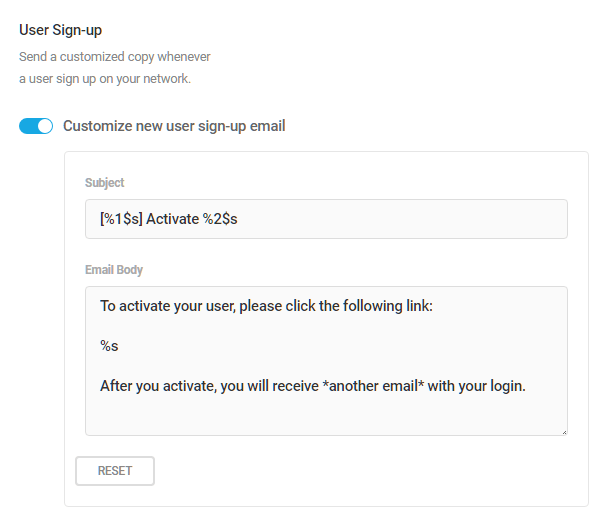
User Sign-up
To customize the email generated when a new user signs up on your network, click the button enabling Customize new user sign-up email. If you want, replace the word “Activate” with a custom subject line. Do not edit the php variables.
Likewise, you can change the text in the Email Body field to whatever you prefer, but do not editing the existing php variables.
Click Reset if you want to return the customization fields to their default states after saving any changes.
Site Activation
To customize the email generated whenever a new site is registered on your network., click the button enabling Customize new site activation email. If you want, replace the words“New Site” with a custom subject line. Do not edit the php variables.
Likewise, you can change the text in the Email Body field to whatever you prefer, but do not editing the existing php variables.
Click Reset if you want to return the customization fields to their default states after saving any changes.

Click Save Changes at the top of the module to save your customizations.
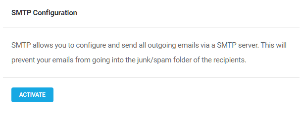
7.3.4 SMTP
Link to chapter 3The SMTP Module allows you to configure your email settings to support sending emails via a SMTP server. This will prevent your outgoing emails from going into the junk/spam folder of the recipients. Click Activate to proceed.
You will also have to make changes to the settings of your webmail service (Gmail, Google Workspace or Outlook.com) or client application (Outlook, Apple Mail) in order to send domain emails from another email account. For more info on that, see this post on our blog.
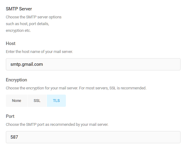
You will need to gather some information from your email host before configuring the SMTP email module. This includes the host name of your mail server (for example: smtp.gmail.com), the encryption type (typically SSL), and your host server’s SMTP port.
See Additional configuration examples below for details when using common SMTP hosts.
From Headers
The “From Headers” settings determine the default email address and name for all of your site’s outgoing SMTP emails.
Enter the email address that emails should be sent from. This must be an email address associated with your domain. In other words, if your domain is somesite.com, you cannot send email from anothersite.com
Enter the name you want to appear on emails sent from your website into the “From name replacement” field. Be aware that the name entered here will override the from name entered for other plugins such as Contact Form. Click the Disable button if you wish to use the name entered in the “From Headers” module to apply to SMTP emails as well.

SMTP Server
Enter the host name of your mail server, choose the encryption for your mail server, and enter the port recommended by your mail server. For most servers, SSL or TLS is recommended.
Click the Enable button if you want to authorize insecure and self-signed SSL certificates on your SMTP server, although this is not recommended.

SMTP Authentication
Click the Enable button to use SMTPAuth. SMTP authentication means that every email sent from your site will be identified with the username and password associated with that particular email account. This greatly reduces the risk that your emails will be rejected by the receiving email server, and makes it harder for spammers to use your account to send bulk email through your server, which can damage your site’s reputation.

Note that while you can use the SMTP Server and Authentication info from one domain on a different domain altogether, it is not recommended to do so as email clients would likely interpret that as spam and defeat the whole purpose of using SMTP.
Once you’ve finished configuring things, click the Send Test Email button at the top to send yourself a test email to ensure the setup is working as expected.

Additional configuration examples
This section provides some configuration examples for some of the more common SMTP hosts:
- WPMU DEV Webmail
- WPMU DEV Hosted Email
- Gmail
- Host/cPanel
- Sendgrid
- Mailgun
- Office365
- Zoho Mail
- Brevo
- Mailchimp (Mandrill)
WPMU DEV Webmail
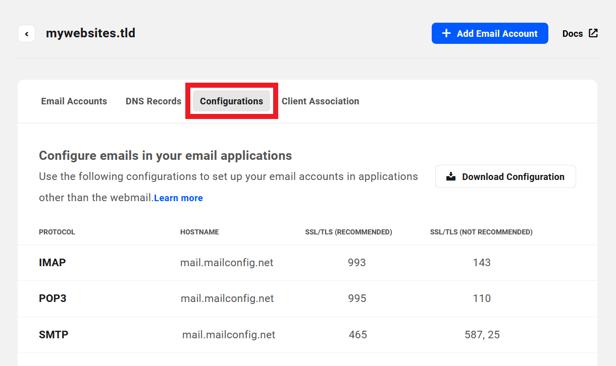
To use a webmail address that you have set up in the Webmail feature in your Hub for SMTP in Branda, go to the Configurations section of the webmail domain you want to use.
You’ll find the SMTP connection info at the bottom of the list where you’ll see the hostname of your mail server is: mail.mailconfig.net.
Be sure to enter your webmail address in both the Sender email address and the SMTP Authentication username fields in Branda. The authentication password is the password for that webmail account.
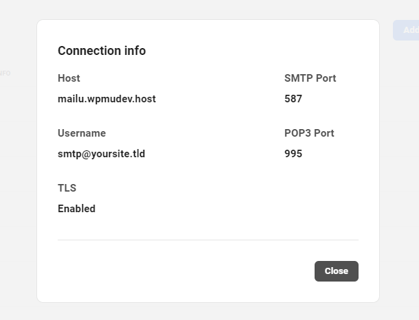
WPMU DEV Hosted Email
To use an email address from your own WPMU DEV hosted site for SMTP in Branda, go to the Hosting tab for the site you want in your Hub. Under Emails > Email Accounts > Active Email Accounts, click the Connection Info icon for the email account you want to use.
You’ll see the hostname of your mail server is: mailu.wpmudev.host
Be sure to enter your WPMU DEV hosted email address in both the Sender email address and the SMTP Authentication username fields in Branda. The authentication password is the password for that email account.
Gmail
Google has recently discontinued their “Less secure apps” option. So if you want to use Gmail SMTP, you’ll need to first ensure that
- you have 2-step Verification enabled in your Google account, and
- you will need to use an app-specific password in the SMTP Authentication field.
Then you’ll want to use the following Gmail SMTP info:
- Server: smtp.gmail.com
- Port: 587
- Encryption: TLS
- SMTP Authentication: Your Gmail address and app-specific password
To create an app-specific password, go to Security > 2-Step Verification in your Google account, and scroll to the bottom of the page. Click the caret icon in the App passwords section.

If you have difficulty finding this section in your Google account, try this direct link: https://myaccount.google.com/apppasswords
Click either the Select app or Select device dropdown and select the Other (Custom name) option.

Enter any recognizable name you like for your app password and click the Generate button.
Then copy the 16-letter code from the yellow box and paste it into the SMTP Authentication > Password field in Branda.

Note that this is the only time the password will be displayed. So if you forget it and need it again, you’ll need to delete and create again.
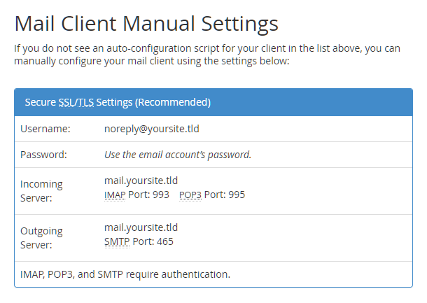
Host/cPanel
To use the SMTP settings provided by your host, go to the Email Accounts section in your cPanel and click “Connect Devices” for the account you want to use. You’ll then see the Outgoing Server info you need in the “Mail Client Manual Settings” section.
Sendgrid
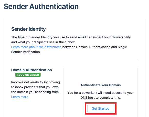
To use SMTP from your Sendgrid account, you’ll first need to authenticate your domain. To get started, expand Settings in the Sendgrid sidebar and click Sender Authentication. Then, click Get Started next to Domain Authentication.
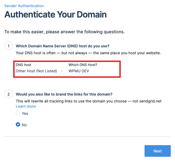
Select Other Host (Not Listed) from the DNS host dropdown menu, and then enter WPMU DEV in the host field. Click Next.
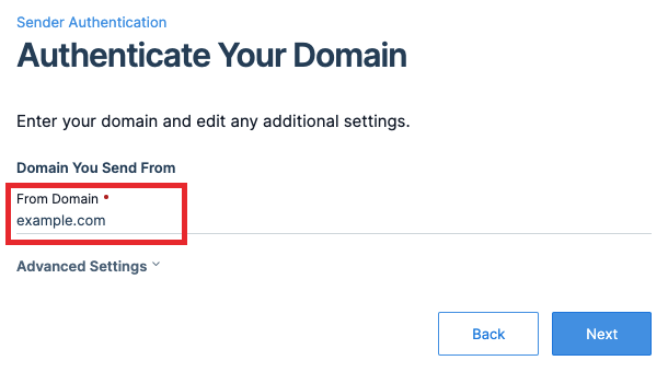
Enter your domain name in the From Domain field, and click Next.
Finally, you’ll need to add 3 Sendgrid CNAME records via The Hub DNS Manager, which you can do with the help of our DNS Manager guide.

When adding each DNS record, copy the Host and Value strings from the Sendgrid website and paste them into the Hostname and Alias fields in the Add New DNS Record modal. Be sure to add a trailing period to each hostname to indicate that the domain shouldn’t be added as a suffix.

After adding all 3 CNAME records, click Verify on the Sendgrid website to complete the domain authentication process.

With the domain authenticated, you can now setup SMTP with Sendgrid. To do so, expand Email API in the Sendgrid sidebar and click Integration Guide. On the Integration page, choose SMTP Relay as the setup method.

Next, enter an API key name and click Create Key.
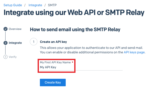
You’ll then see the info required for Branda’s SMTP Server settings.
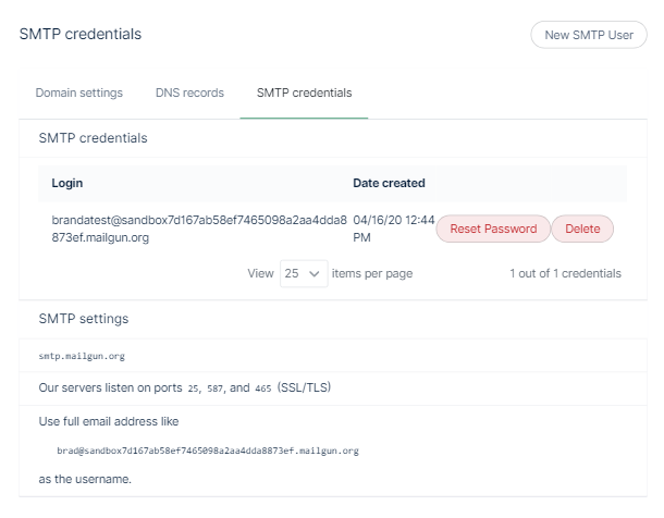
Mailgun
To use SMTP from your Mailgun account, click on Sending > Domain Settings in the sidebar menu, then click the “SMTP Credentials” tab. Click “New SMTP User” at top-right and enter the username you want to create, then click “Create SMTP Credential”. You’ll then see the info you need to enter in Branda in the “SMTP Credentials” and “SMTP Settings” sections.
Office365
To use SMTP from your Office365 account, you’ll want to use the following SMTP info:
Server: smtp.office365.com
Port: 587
Encryption: STARTTLS or TLS
SMTP Authentication: The username & password for your Office365 mailbox.
Note that you may need to enable Authenticated SMTP for your mailbox so that address can send email via SMTP.
Log into your Microsoft 365 admin center. Go to Users > Active users, select the user, and click Mail in the flyout that appears. Then in the Email apps section, click Manage email apps.
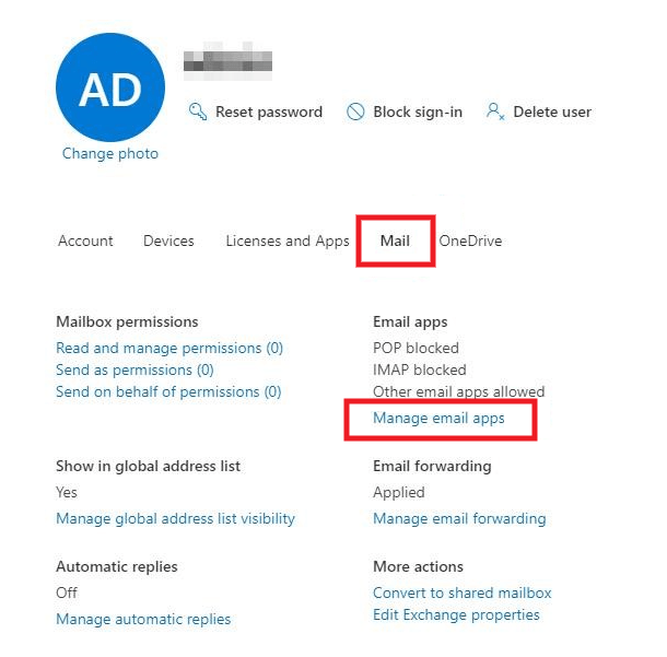
Ensure the Authenticated SMTP box is checked.

See this Microsoft article if you need help with that setting.
Zoho Mail
To use SMTP from your Zoho account, use the following SMTP info:
Server: smtppro.zoho.com (for domain-based email addresses, [email protected]) or smtp.zoho.com (for personal accounts, [email protected])
Port: 465 with SSL or 587 with TLS
SMTP Authentication: The username & password for your Zoho mailbox.
You must add the full email address and correct password while setting the SMTP server. In case you have 2FA enabled, you need to create an app-specific password. Check Zoho’s article for more information.
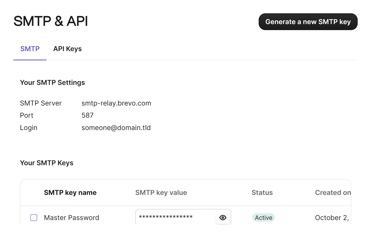
Brevo
To use SMTP from your Brevo account, log in to your Brevo account and click on your name in the top-right corner, then click SMTP & API. Navigate to the SMTP tab. You will find the information that you need to enter in Branda’s SMTP Settings and SMTP Authentication sections. For the Encryption, choose TLS.
Mailchimp (Mandrill)
Please note that SMTP via Mailchimp is only possible via subscribing to a paid transactional email plan. While on a free plan (demo mode), you can only send emails to email addresses registered with your verified domain only. This means that you won’t be able to send emails registered with other domains such as ‘gmail.com’
To use SMTP from your Mailchimp account, you’ll first need to authenticate your domain. To get started, click Settings in the Mandrill sidebar and go to the Domains tab. Enter your domain name, and click Add.
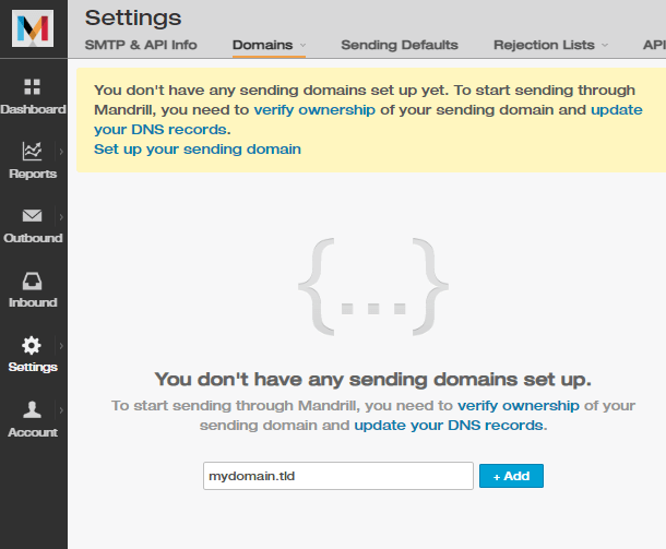
You’ll need to add 3 Mandrill TXT records to verify your domain and enable DKIM and SPF email authentication for that domain. See Mailchimp’s guide for instructions on configuring DNS. You can add these records via The Hub DNS Manager, which you can do with the help of our DNS Manager guide.
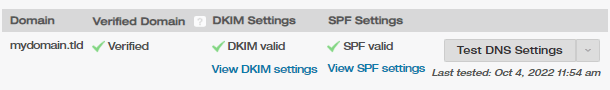
Once you have added the DNS records, click the Test DNS Settings button. You should see three green checkmarks indicating that you have correctly added the records.
With the domain authenticated and DKIM and SPF records added, you can now set up SMTP with Mandrill. Go to the SMTP & API info tab and click the Add API Key button.
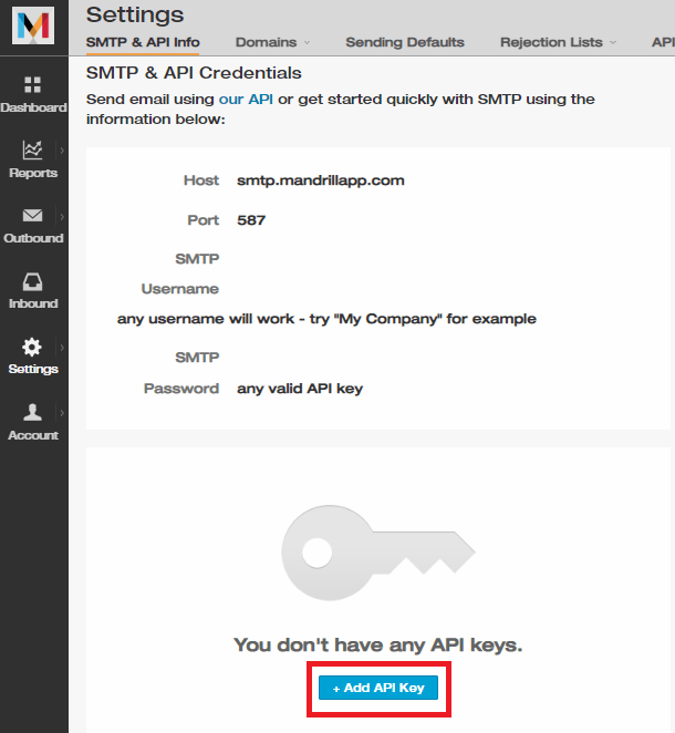
Add the information present on that page to Branda’s SMTP Server section. In the SMTP Authentication section, enter any username in the Username field and for the Password, paste the API Key you generated in the last step.
Sometimes, emails from your domain may end up in the Gmail spam folder for various reasons, including false positives. If this happens, you can report it to Gmail and authenticate your domain using https://postmaster.google.com/. For more information, refer to Google’s official Email Sender Guidelines and Google Help.
7.3.5 Email Logs Pro
Link to chapter 3The Email Logs feature works hand-in-hand with SMTP to help you keep track of your outbound email history. Click Activate to get started.
Ensure that you have the SMTP module active so that you can start storing email logs.

If you haven’t sent any emails yet, this area will be void of any email history but it will populate as soon as there are logs to show. You can refer to the SMTP section in this document for more information on how to set up your SMTP.
Once you have accumulated some emails, you will see them appear in your log with the following key details about the emails.
- Recipient – To whom the email was sent.
- Sent at – The date and time of the email.
- Subject – The subject of the email.

Click on the row of the email to expand the information and view details like:
- From Name – The name that you set under From Headers in the SMTP tab.
- From Email – The email address from which the email was sent.

Click the Delete button to remove that email log or you can click on Export to export the email details as a .csv file.
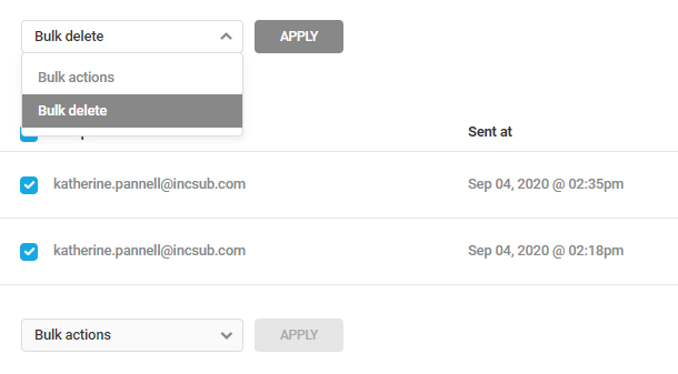
If you’re wanting to manage your emails in chunks, you can use the bulk action tool to do this. Simply click on the checkbox next to each email you want to action, click on Bulk actions, select the action that you want and click Apply.
Wanting to view your past emails in a more manageable way? Achieve this in a few clicks with the Filter feature. Click on the filter icon and choose your criteria based on:
- Email Date Range
- From Email
- Recipient
- Keyword
- Sort By
- Sort Order
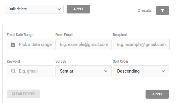
After you have set up your filter criteria, click Apply to action the filters. You can also click Clear Filters to remove all of your criteria.
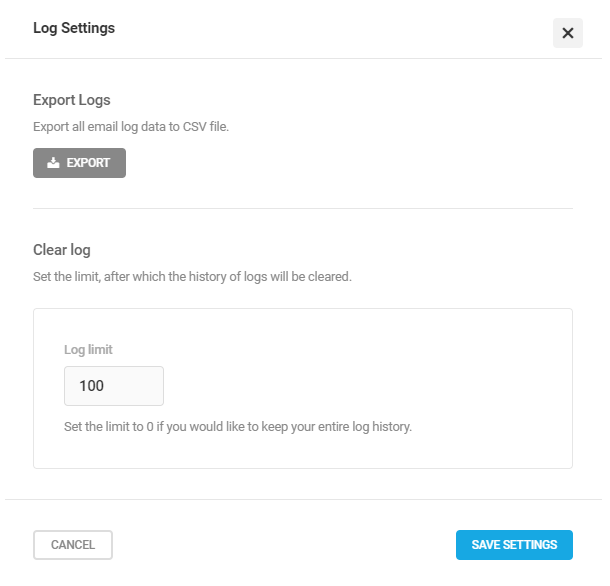
To access the email logs settings, click the Settings button in the top right-hand corner. This will open a module that allows you to export all of your email details as a .csv file by clicking Export, as well as setting the limit for your clear log. Set the Log limit to cap the number of logs that will be kept, after which they will be cleared. If you set the Log limit to 0, your entire log history will be kept.
To disable the email logs feature, click on the Deactivate button in the top right-hand corner.
7.4 Front-end
Copy chapter anchor to clipboardThe Front-end modules enable you to customize every bit of the front-end of your WordPress website to match your website’s theme.
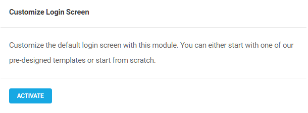
7.4.1 Login Screen
Link to chapter 4The Login Screen module allows you to customize the default login screen using a WPMU DEV template or from scratch. Click Activate to proceed.
Branda enables you to brand every inch of your site and the login screen is just one of the many areas you can customize. For a quick guide to the login screen tool, read our blog on how to Impress Clients With a Custom Login Page.
Note that any customizations you make to the login screen will also be reflected on the Password Reset and Registration screens.
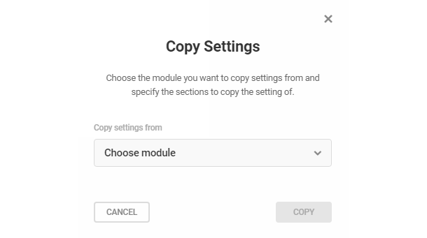
Copy Settings
This feature allows you to copy the logo and/or background images used elsewhere in Branda to your Login Screen. Click the Copy Settings at top-right, then select from the menu those items you wish to apply to your Login Screen. Click Copy to add the elements to this module.

Login Screen Template
Begin by clicking Choose a Template to pop open the template selection modal.
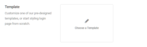
Select either a pre-built template or the Start from scratch option, and click Continue to save your choice.

Then use the Content, Design and Color panels below to customize any element from the selected pre-built template or to build your login screen from scratch. Click the arrow next to any item to access that item’s customization options.
Content
These options enable you to adjust the default content of the login screen.
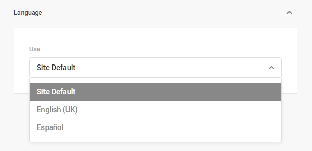
Language
If you have set any language other than the WordPress default in your admin’s Settings > General > Site Language option, you will be able to select the default language for your login screen here.
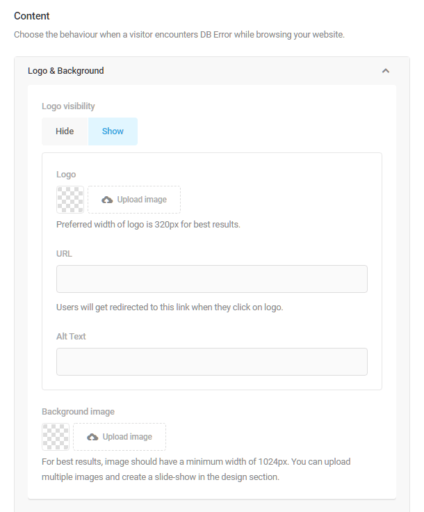
Logo and Background
Use the upload image tool to add a logo and/or a background image. Enter a URL into the field provided if you want the logo, when clicked, to redirect visitors to another page. Add alt text to assist screen readers and allow search engines to better crawl and rank your website.
- Logo visibility – Select whether to show or hide your logo on the login screen.
- Logo – Click the Upload Image button to upload a custom image for your logo.
- URL – Enter the URL users should be directed to if they click your logo. If left blank, the logo will link to the login page by default.
- Alt Text – Add alt text to assist screen readers and allow search engines to better crawl and rank your website.
- Background image – Click the Upload Image button to upload one or more images for your login screen background. If multiple images are uploaded, you can create a slide-show in the design section.
Message
If desired, you can enter a custom message that will display on your login screen between the logo and the login form.

Form
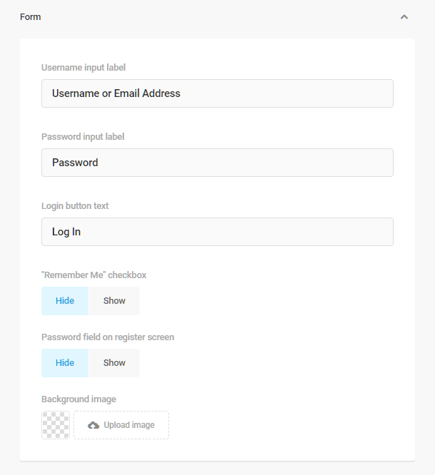
Customize the login form displayed within your login screen using the form options. Enter custom labels for your login screen fields and button, choose whether to add a Remember Me option, and even whether to add a background image to the screen’s login fields.
- Username input label – Customize the label for the username input field.
- Password input label – Customize the label for the password input field.
- Login button text – Customize the text that appears on the login button.
- “Remember Me” checkbox – Choose to show or hide the Remember Me checkbox, and whether it should be checked or unchecked by default.
- Password field on register screen – Choose to show or hide the password input field on your register or signup screen.
- Background image – Optionally upload a background image that will appear in the form, behind the input fields.
Error Message
Use the Error Message options to customize the text that will display when a user enters incorrect text into a field or fails to enter anything at all.
- Empty username – Customize the error message that appears if the username field is empty, or leave it at the default message.
- Invalid username – Customize the message that appears if the username entered is not in a valid format. You can use the WP_LOSTPASSWORD_URL placeholder in this field; it will be replaced by the actual URL to your lost-password form. See this article for more on username sanitization in WordPress: https://codex.wordpress.org/Function_Reference/sanitize_user
- Empty password – Customize the message that appears if the password field is left blank.
- Invalid password – Customize the message that appears if the password entered is incorrect for the username entered above. You can use the WP_LOSTPASSWORD_URL placeholder in this field as well.

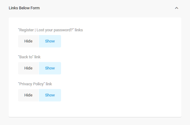
Links Below Form
The Links Below Form options simply allow you choose to display or hide the register & lost password links, “Back to” link, and whether to provide a link to your site’s privacy policy.
Login Screen Design
Use the Design options to adjust the appearance of various elements such as Logo, Background & Form as well as the Error Messages displayed when users interact with your login screen.
Logo
The Logo options allow you to adjust the position, width, height, and margins of your logo and the look of its container.
- Width – The logo width set here should ideally be smaller than the width of the form itself (default width is 320px). You can adjust the form & canvas widths below.
- Opacity – Adjust the logo opacity if you want it to be a bit transparent and let the login screen background show through.
- Position – Align the logo to the left, right or center.
- Margin – Adjust the margins if needed using px, percentage, em or rem values.
- Corner Radius – Adjust the corner radius to give your logo rounded corners.
Background
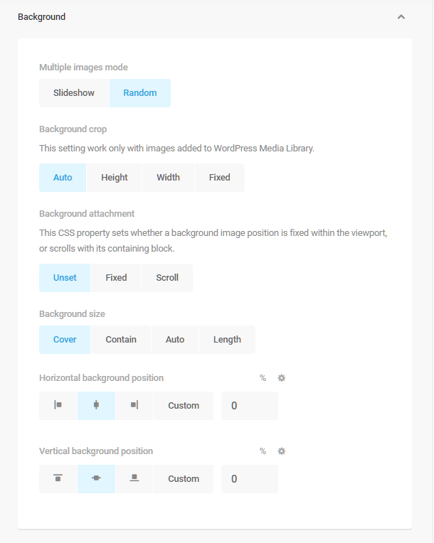
Background options allow you to adjust the design and behavior of your login screen’s background images. You can create a slideshow of multiple background images, and adjust those images’ size and position.
- Multiple images mode – If you have uploaded multiple images for your login screen background in the Content settings above, you can choose to show them either as a continuous slideshow, or show only one image at random each time a user accesses the login screen.
- Background crop – Use these options to crop the background image(s) if desired to change the height, width or both.
- Background attachment – Set the background to remain fixed on the screen regardless of the length of the page contents, or allow it to scroll with the contents.
- Background size – Select Cover to ensure images fill the screen even if one of the dimensions must be cut off a bit; select Contain to ensure images display fully even if that means blank areas top & bottom or on the sides; select Auto to display images at their original dimensions; select Length to set images to a fixed percentage of screen size.
- Horizontal background position – Choose to position images to the left, right or centered, or set a custom percentage of screen width as the offset from the left side of the screen.
- Vertical background position – Choose to position images at top, bottom or vertical center, or set a custom percentage of screen height as the offset from the top of the screen.

Message
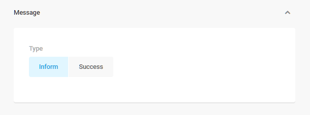
This option simply enables you to select either of the two default WordPress message styles: Inform (blue border) or Success (green border).
Form
The Form options allow you to customize the look of the login form container by adjusting its border, margins, button style, and the fit of the background image if you chose to add one.
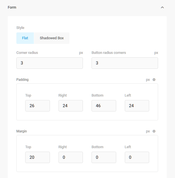
- Style – Either leave this at the default flat style, or select shadowed box, and set the box-shadow options.
- Corner Radius – Adjust the corner radius if you want the form to have rounded corners.
- Padding – Adjust the padding values to give more room between the form fields and the form border.
- Margin – Adjust the margin values to give more room outside the form.
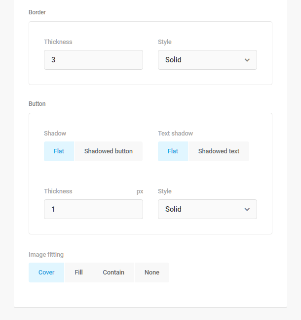
- Border – Adjust the form border thickness and style.
- Button – Select either flat or shadowed style for the button and button text.
- Image Fitting – If you have added a background image for the form in the Content settings above, you can adjust its fit properties here (same as for the Background image design above).
Error Messages
This option simply enables you to adjust the opacity of the error messages if desired.

Links Below Form
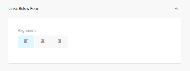
This option enables you to adjust the alignment of the links that appear beneath the form (register, lost password, return to).
Form Canvas
The Form Canvas is the element that contains the login form itself. These options allow you to customize the look of the login form canvas by adjusting its position, width, height, padding, and margins.
- Position – Adjust the position of the form canvas to the left or right of the screen, or leave it at the default (center).
- Width – Adjust the width of the canvas using pixel, percentage, em or rem values.
- Height – The Default option will ensure the canvas height self-adjusts to contain the login form; the Device Height option will ensure the canvas displays at the ful height of the device viewport.
- Padding – Adjust the canvas padding using pixel, percentage, em or rem values.
- Margin – Adjust the canvas margin using pixel, percentage, em or rem values.

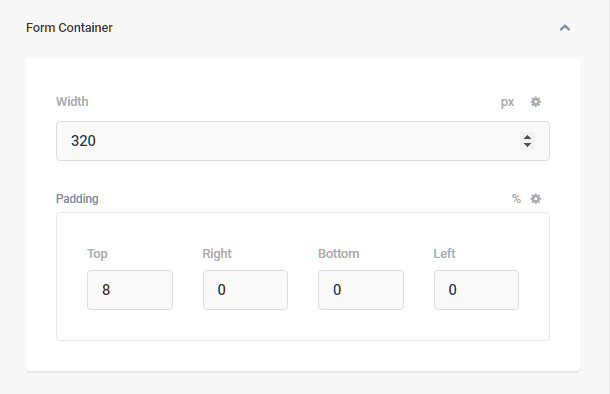
Form Container
The Form Container options enable you to adjust the default width and padding of the login form itself.
- Width – Adjust the width of the form using pixel, percentage, em or rem values.
- Padding – Adjust the padding uing pixel, percentage, em or rem values.
Colors
Use the color pickers to modify the default colors for every element of your login screen to better match your brand.
Background
This option allows you to set the main background color for the login screen itself.

Form
Customize the colors for each state (Default, Active, Focus, Hover) of every element of your login form.
- Input label – Customize the color of the form field labels like username & password.
- Input color – Customize the color of the text the user inputs into the fields.
- Input border – Customize the color of the field borders.
- Input background – Customize the input field background color.
- Button label – Customize the color of the text on the login button.
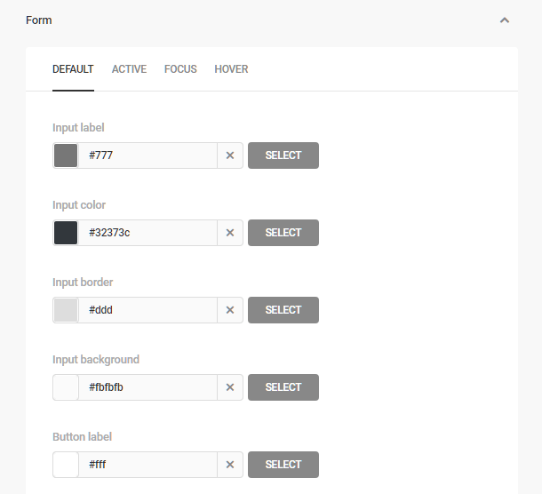
- Button border – Customize the color of the login button border.
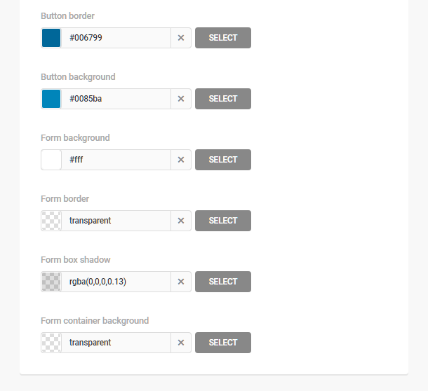
- Button background – Customize the color of the login button background.
- Form background – Customize the background color of your login form.
- Form border – Customize the color of the login form border.
- Form box shadow – If you have selected the Shadowed Box option in the Design section above, you can customize the color of the box shadow for your login form here.
- Form container background – Customize the background color of the form container (that’s the element that contains the form itself, the logo & optional message at top, as well as the links beneath the form).
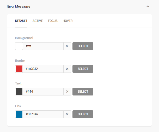
Error Messages
Customize the colors for each state (Default, Active, Focus, Hover) of the error messages that may display in your login form when users interact with it.
- Background – Customize the background color of any error message that appears in your login form.
- Border – Customize the border color of error messages.
- Text – Customize the text color of the error messages.
- Link – Customize the link color of the error messages.
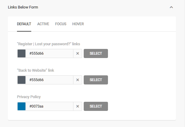
Links Below Form
Customize the colors for each state (Default, Active, Focus, Hover) of the links that appear beneath your login form.
- “Register | Lost your password?” links – Customize the colors of the Register | Lost your password? links.
- “Back to Website” link – Customize the colors of the Back to Website link.
- Privacy Policy – Customize the colors of the Privacy Policy link.
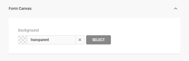
Form Canvas
This option enables you to change the background color of the form canvas element.
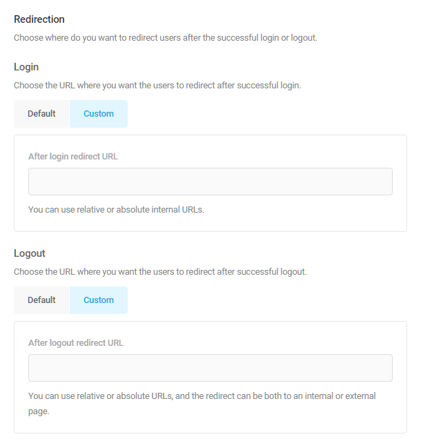
Login Screen Redirection
Enter the URLs redirecting users following a successful login or log out.
- Login – Choose either to leave this at the default, or enter a custom URL where users should be redirected after logging in.
- Logout – Choose either to leave this at the default, or enter a custom URL where users should be redirected after logging out.
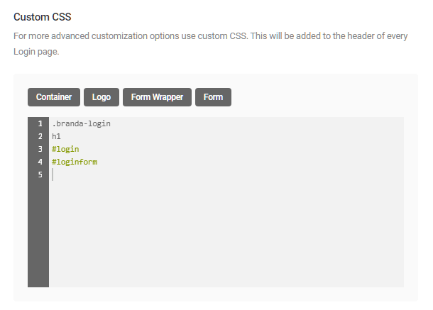
Login Screen Custom CSS
Use the CSS editor to achieve advanced customization options. Your custom CSS will be added to the header of every Login page. Selector buttons are provided for some of the most common admin elements, but you can of course add any custom CSS here that would apply to the login screen only.
- Container – Applies CSS to the canvas element.
- Logo – Applies CSS to the logo container.
- Form Wrapper – Applies CSS to the form container.
- Form – Applies CSS to the form element itself.
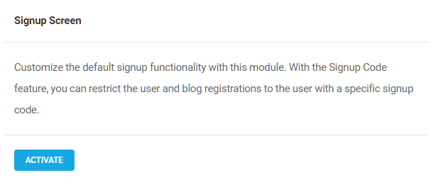
7.4.2 Signup Screen
Link to chapter 4The Signup Screen module allows you to restrict user and blog registrations to the users with a specific signup code. Click Activate to proceed.
User Registration
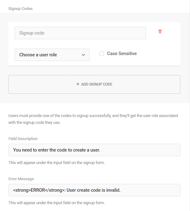
Select the With Signup Code option to require users to obtain and enter a code before registering with your site. Select Anyone if you do not wish to requires codes.
Signup Codes – Enter the code the user needs to input to successfully register, select the user role to be assigned to new users registering with that code, and check the Case Sensitive box if uppercase/lowercase characters in the code must be an exact match.
Field Description – Customize the help text that appears beneath the signup code field.
Error Message – Customize the error message that appears if the code entered does not match any valid codes you have set up.
To create additional codes for additional user roles, click the + ADD SIGNUP CODE button.
Blog Registration (Multisite Only)
Select the With Signup Code option to require users to obtain and enter a code before creating a blog in your multisite. Select Anyone if you do not wish to requires codes.
The options for this section of this module are identical to the User Registration above, with the exception of the User Role option as there is no need for that when creating a blog.
7.4.3 DB Error Page
Link to chapter 4The Database Error Page module allows you to customize both the content of your DB Error message and your site’s behavior when a visitor encounters an error. Click Activate to proceed.

Copy Settings
This feature allows you to copy the logo and/or background images used elsewhere in Branda to this DB Error Page. Click the Copy Settings at top-right, then select from the menu those items you wish to apply to your DB Error Page. Click Copy to add the elements to this page.
Preview
By default, the preview feature is not available until you create your DB Error Page. To preview the page, create it, and save your changes, then click the preview button.

Content
Logo & Background
Click the arrow next to the Logo & Background option, then use the upload image tools to add a logo and/or a background image. Enter a URL into the field provided if you want the logo, when clicked, to redirect visitors to another page. Add Alt Text is you so desire.
NOTE: You can add multiple background images to your DB error page that display in a slideshow. Customize the behavior of multi-image backgrounds in the Design section.
Custom Error Message
Enter a custom title in the field provided, if you wish, and create your custom error message in the editor.

Social Accounts
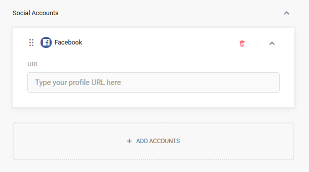
To add your social network sites to your custom error message, click the arrow next to Social Accounts, then click Add Accounts. From the menu of social networking sites, select the accounts you wish to add, and click Add Accounts.
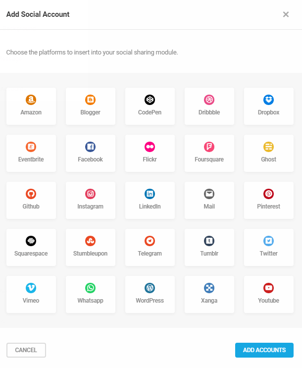
Unlike the Author Box module above, adding social accounts here does not add a field in your WordPress user profile. Each added account must be configured here as they only appear on your custom DB error page. You can delete added accounts using the delete icon to the right of each social network.
Design
Click the arrow to the right of the message element you wish to modify to reveal the design customization options for that element. Click the Save Changes button at the top of the module to preserve your modifications or Reset to return the elements to their default settings.

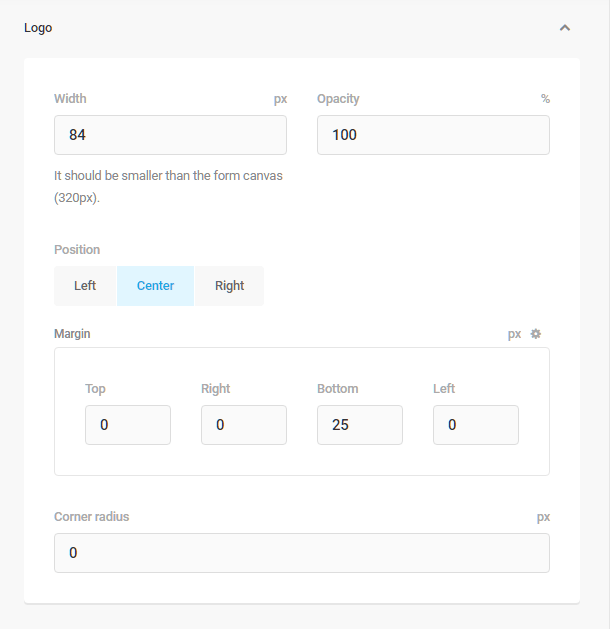
Logo
- Width – Enter the width you wish the logo to be displayed.
- Opacity – Enter the the desired opacity of the logo.
- Position – Select whether you want the logo to appear in the left or right corner or centered on the page.
- Margin – Enter the preferred page margins.
- Corner radius – Adjust the roundness of the avatar’s container by entering the desired radius, in pixels, into the field. The lower the number, the sharper the corner.
Background
- Multiple Images Mode – This mode only applies if you uploaded multiple background images. Select Slideshow if you wish the images to display and transition in a classic slideshow, and select Random if you want the images to display and transition in random order.
- Background crop – You can crop the background image here to a percentage of the viewport size, or to fixed dimensions.
- Background attachment – Select whether the background image should be fixed in the viewport or scroll with the content.
- Background Size – Choose whether and how the background image is resized to fit within the page container.
- Horizontal background position – Choose whether the image should be oriented on the left, right or centered on the page.
- Vertical background position – Choose whether the image will be oriented on the top, bottom or centered on the page.

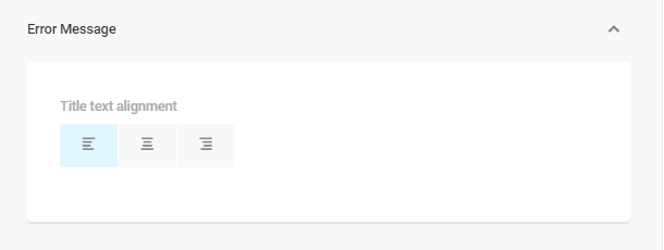
Error Message
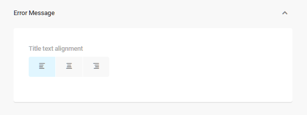
Choose a flush left, flush right or centered justification for the error page message.
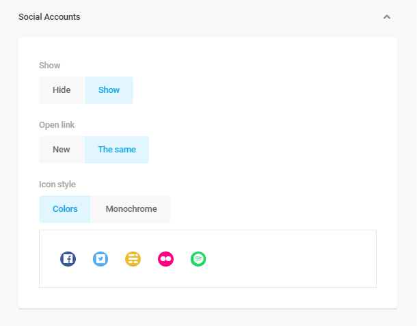
Social Accounts
Show – Select Show to display the social network accounts you added in the Content section.
Open Link – Select New if you want the social network links to open in a new tab, or select The same if you want them to open in the current tab.
Icon Style – Select Color if you want the social network icons to display in color, or select Monochrome if you want them to display in black and white.
Content Wrapper
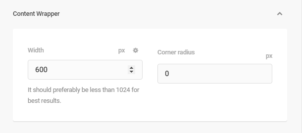
Enter the width of the page’s main content wrapper. All other settings will be applied relative to and within this wrapper. Use the Corner Radius field to adjust the roundness of the avatar’s container by entering the desired radius, in pixels, into the field. The lower the number, the sharper the corner.
Reset
The Reset button will return all design settings to their default state.
Colors
Click the arrow to the right of the content area you wish to modify to reveal the color picker for that area.

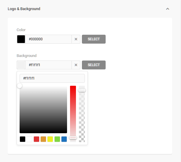
Logo and Background
Click the color swatches to open the color pickers, and choose the colors you want applied to the logo and background. You can also enter the Hex Color Code in the field provided. Click Select to confirm your choice.
Error Message
Click the color swatches to open the color pickers, and choose the colors you want applied to the title and error message text. You can also enter the Hex Color Code in the field provided.
Content Wrapper
Click the color swatch to open the color picker, and choose the color want applied to the background of the DB Error Page. You can also enter the Hex Color Code in the field provided.
Custom CSS
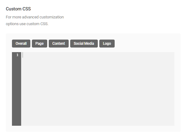
Add custom CSS to the DB Error Page for more advanced customization. Custom CSS will override customizations made elsewhere in this module. Preset identifier and selector buttons have been provided to simplify CSS customization.
- Overall – Customize the page background.
- Page – Customize the area surrounding the Error Message content. This area is where your custom logo will appear, if one has been added.
- Content – Customize the Error Message container, including the message itself, if you wish.
- Social Media – Customize the Social Accounts container.
- Logo – Customize the logo container. Typically, a custom logo fills the container, but with custom CSS you can create a larger container and customize the area around the logo.

7.4.4 Site Status Pages (Multisite Only)
Link to chapter 4The Site Status Pages module applies to multisite networks only. Use the module to create a default error page to display when network sites are deleted, archived, have become inactive or spammed. Click Activate to proceed.

Copy Settings
To ensure thematic consistency, you can copy the logo and/or background images from other pages you’ve created and apply them to your error pages. Click the Copy Settings button, then select from the menu those items you wish to apply to your the page. Click the Copy button to complete the copy process.

Modes
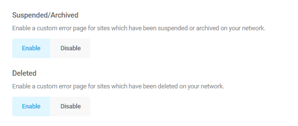
Suspended, Archived or Deleted Pages
Click the Enable/Disable button beneath the Suspended/Archived and/or Deleted labels to apply or remove a custom error page from sites which have been suspended, archived or deleted from your network.
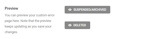
Preview
Click either button here to view a preview of your Suspended/Archived or Deleted error pages. The preview will update every time you save your changes.
Content
Adjust the content of your site error pages by adding a logo, background image, custom messages, and links to social accounts.
Logo & Background
- Logo visibility – If you select to show a logo on your site error pages, use the image uploader to add a custom logo, add the URL of the page to which visitors will be redirected when the logo is clicked and add the desired Alt Text to assist web readers and search engines to crawl your site.
- Background image – Use the image uploader to add a custom background image. You can add multiple background images and create a slideshow using the Design panel below.
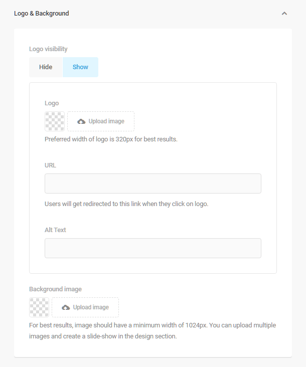
Error Message
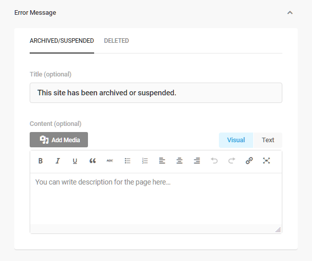
Click the arrow next to “Error Message”, and use the post-type editor to create your custom messages for archived/suspended or deleted sites.
Social Accounts
To add social network sites to your default site status page, click the arrow next to “Social Accounts”, and then click the Add Accounts button. From the menu of social networking sites, select the accounts you wish to add, and click Add Accounts. You can delete added accounts using the trash icon to the right of each social network.
The options here are identical to the Social Accounts options in the DB Error Screen module above.

Design
The Design panel allows you to tweak the design of elements on your default status pages, such as adjusting the size and position of elements and creating a slideshow of background images.
Logo
The options here are identical to the Logo options in the DB Error Screen module above.
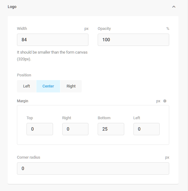
Background
The options here are identical to the Background options in the DB Error Screen module above.
Error Message
Choose a flush left, flush right or centered justification for the error page message.
Social Accounts
The options here are identical to the Social Accounts options in the DB Error Screen module above.

Click the arrow next to “Social Accounts” to choose whether social icons, when clicked, open in the current tab or in a new one. You can also choose whether the icons will be monochrome or color.
Content Wrapper
Enter the width of the page’s main content wrapper. All other settings will be applied relative to and within this wrapper. Use the Corner Radius field to adjust the roundness of the avatar’s container by entering the desired radius, in pixels, into the field. The lower the number, the sharper the corner.

Reset
The Reset button will return all design settings to their default state.
Color settings
Logo and Background
Click the color swatches to open the color pickers, and choose the colors you want applied to the logo and background. You can also enter the Hex Color Code in the field provided. Click Select to confirm your choice.
Error Message
Click the color swatches to open the color pickers, and choose the colors you want applied to the title and error message text. You can also enter the Hex Color Code in the field provided.
Content Wrapper
Click the color swatch to open the color picker, and choose the color want applied to the background of the DB Error Page. You can also enter the Hex Color Code in the field provided.
Custom CSS
Use the CSS editor to apply advanced customization to your default status page. The preset identifier and selector buttons here are identical to the Custom CSS options in the DB Error Screen module above.
7.4.5 Header Content
Link to chapter 4The Header Content module allows you to place custom headers on every page of your site or network. Click Activate to proceed.

Configuration of the options for this module is identical to the Footer Content module. Please see the instructions detailed above.
7.4.6 Footer Content
Link to chapter 4The Footer Content module allows you to place custom footers on every page of your site or network. Click Activate to proceed.
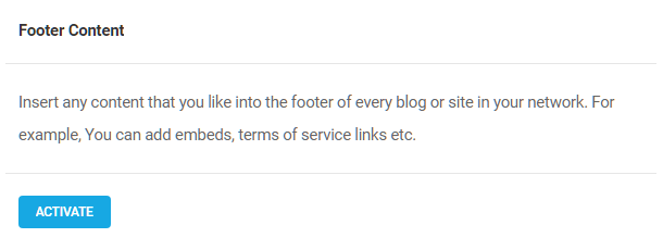
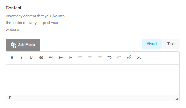
Content
Use the editor to create custom footer content that will appear on every page of your site.
Design
Customize the appearance of your sitewide footer.
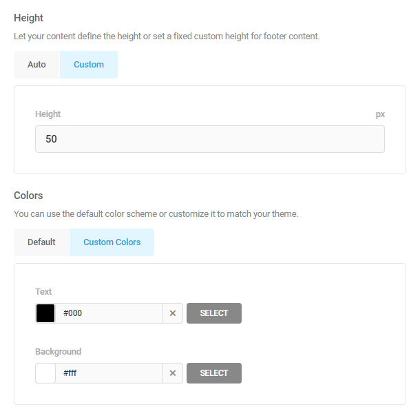
- Height – Click Auto to allow the footer content to determine the height of the footer container, or click Custom and set a fixed container height, in pixels, using the field provided.
- Colors – Use the color picker to set the footer Background and Text colors. Click the color swatch on the left and choose a color from the palette, or enter a color hex code into the field provided. Click Select to save your changes.
Settings
- Integrate into theme footer – Click Enable to display your custom content in your theme’s footer element.
- Parse Shortcodes – Click Enable to customize the footer with shortcodes.

7.4.7 Cookie Notice
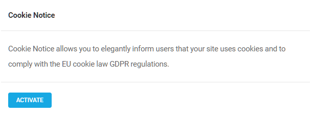
Link to chapter 4The Cookie Notice module allows you to elegantly inform users that your site uses cookies and to comply with cookie and GDPR regulations. Click Activate to proceed.
Note that this module is not a full-blown cookie manager. It simply outputs a customizable notice on the frontend to inform your visitors that cookies are used on your site. When they click the button to accept, Branda sets its own cookie in their browser and will not display the notice again until that specific cookie expires.
By default, the cookie notice appears at the bottom of every page on your site. Configure the options below to customize the appearance.

Content
Message
Use the editor to create a custom cookie notification that will appear to site visitors.

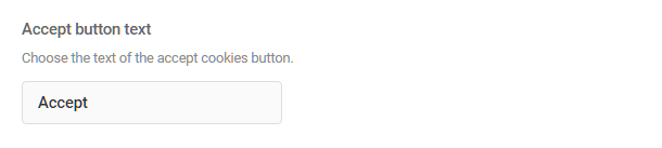
Accept Button Text
Create custom text that appears in the button that users will click to accept the cookie policy.
Privacy Policy link
Choose to show or hide a link to your Privacy Policy page, set custom text for the link, and set it to open in the same tab or a new one.
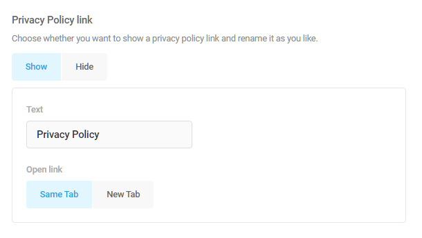
The privacy policy link added with this option will automatically link to the page you have selected under Settings > Privacy in your wp-admin. If no page has been selected there yet, or the selected page does not exist, Branda will alert you so you can go do that first. Click the create or select a new page link to jump to your Privacy Settings.

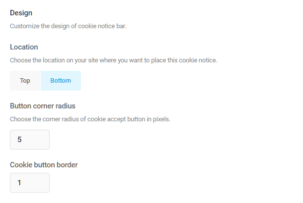
Design
Click Top or Bottom to indicate where on the page you want the notification to appear. Adjust the corner radius and cookie button border to customize the button’s appearance. The lower the number, the sharper the corner.
Colors
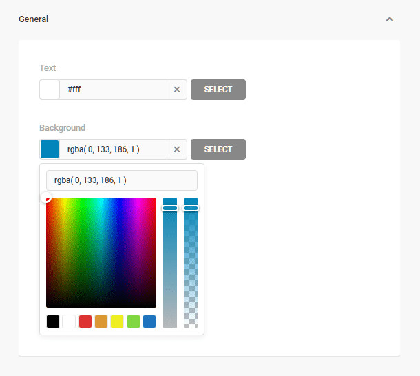
General
Click the arrow on the General tab to reveal the color picker which you can use to customize the colors of the cookie notice button text and background.
Accept Cookies Button
Click the arrow on the Accept Cookies Button tab to reveal the color picker which you can use to customize the color changes that occur when users interact with the Accept button.

Links
Click the arrow on the Links tab to reveal the color picker which you can use to customize the color changes that occur when users interact with any links you may have included in your message text.

Behavior
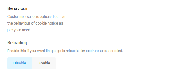
Reloading
Click Disable or Enable to determine if you want the page to reload without the cookies notification after acceptance.
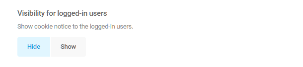
Visibility for logged-in users
Click Hide or Show to determine if the cookie notification should be shown to users who are logged in to the site.
Cookie expiry time
Click the Cookie expiry time drop-down menu to select how long a cookie should be stored.

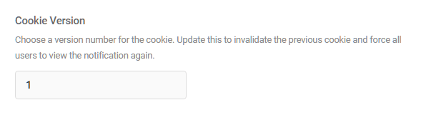
Cookie Version
Enter a number in the Cookie Version field to assign a number to stored cookies. Changing the cookie version will invalidate previous cookies and require visitors to view and accept the cookie policy again.
7.4.8 Author Box
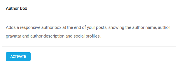
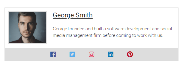
Link to chapter 4The Author Box module adds a responsive author box, inline or as a widget, at the end of your posts, showing the author’s name, biography, gravatar, post history, and social network profiles. Click Activate to proceed.
Configure
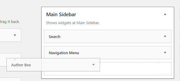
Author Box Widget
From the Admin Menu, go to the WordPress widget manager (Appearance > Widgets), and locate the Author Box widget. Drag and drop it into any sidebar or widgetized area of your theme.
Inline Content
By default, the Author Box module allows you to display the author box as both an inline element or as a widget. Click the Disable button if you want to use the widget author box only.

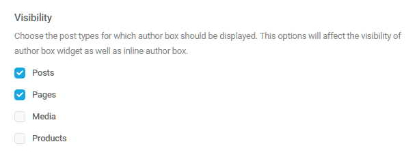
Visibility
Select the post types where the author box should display. This option will affect the visibility of the author box widget as well as inline author box.
Author Profile
Social Accounts
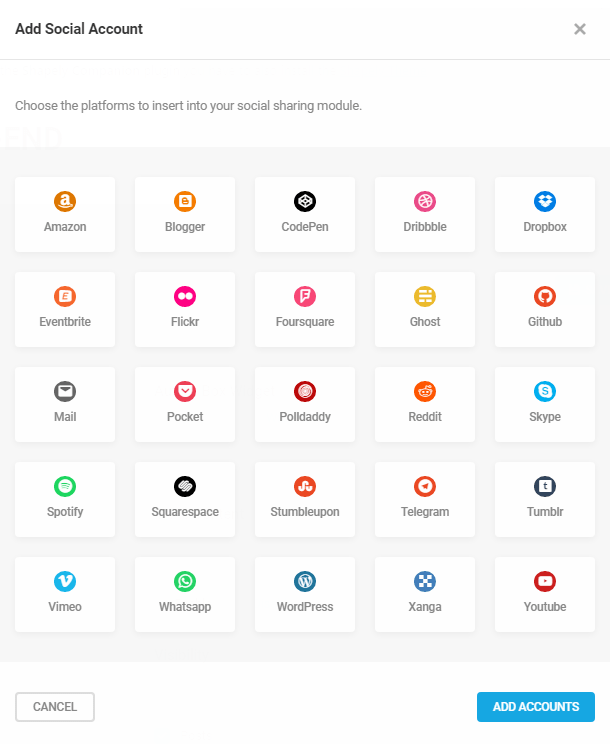
Click the arrow next to Social Accounts and then click the Add Accounts button, to reveal the Add Social Accounts menu.
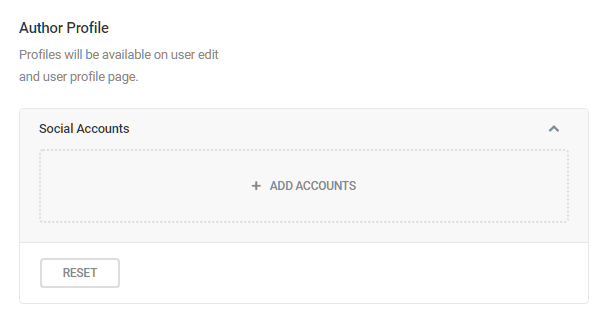
From the menu of social networking platforms, select the social networking sites you want to allow authors to include in their profiles, and click Add Accounts to save your changes. You can delete added accounts using the trash icon to the right of each social network.
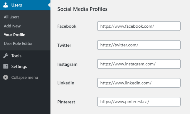
Each account you select here will add a corresponding field to a “Social Media Profiles” section in every user profile where each user or site admin can add/edit the social profile URLs.
Depending on your configuration above, your custom Author Box will appear in your widget and/or in posts and pages and will include a gravatar, bio, article count, and social media links.
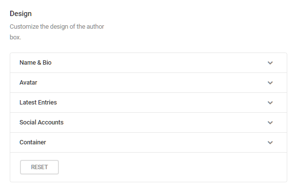
Design
Click the arrow next to any element to reveal the customization options for that element.
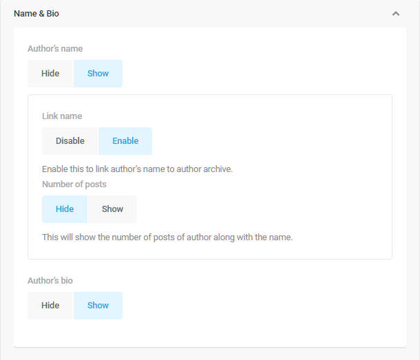
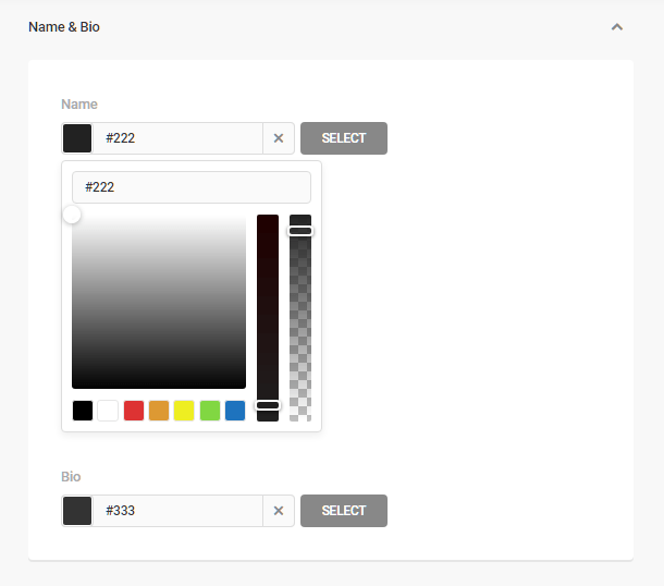
Name and Bio
- Author’s Name – Click Show to display the author’s name in the author box.
- Link Name – Click Enable to link the author’s name to the author archive.
- Number of posts – Click Show to display the number of posts written by the author in parentheses next to the author’s name.
- Author bio – Click Show to display the author’s bio in the author box.
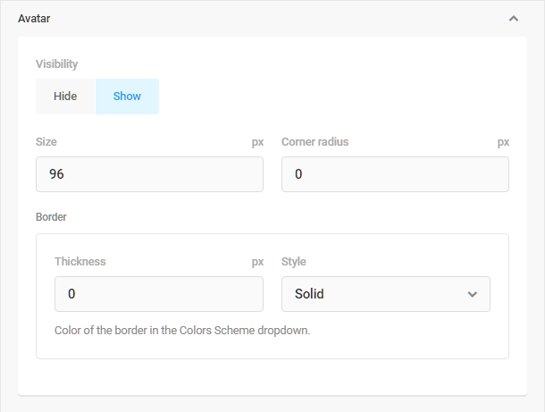
Avatar
- Visibility – Click Show to display the author’s avatar in the author box.
- Size – Adjust the size of the avatar by entering the preferred size, in pixels, into the field.
- Corner radius – Adjust the roundness of the avatar’s container by entering the desired radius, in pixels, into the field. The lower the number, the sharper the corner.
- Border Thickness – Adjust the thickness of the line surrounding the avatar by entering the desired size, in pixels, into the field.
- Border Style – Click the arrow to reveal a drop-down menu from which you can choose the style of the line surrounding the avatar. Adjust the color of the border in the Color Scheme menu.
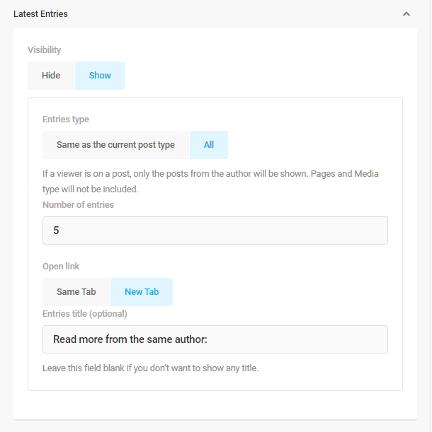
Latest Entries
- Visibility – Click the Show button to display a list of the author’s most recent posts.
- Entries Type – Click All if you want the list to include anything contributed by this author. Click Same as the current post type to filter the items included in the list by post type. With this feature enabled, when the author box accompanies a post, only posts will appear in the list, but not media, such as videos, etc. Conversely, when the author box accompanies a video, only videos contributed by the same author will appear in the list, but not other types of posts.
- Number of entries – Enter the number of items you want to appear in the list.
- Open link – Click the Same Tab if you want the entry list item, when clicked, to open the author archive in the same tab, and click New Tab if you want the archive to open in a new tab.
- Entries title – Enter the title you want to appear above the list. Leave the field blank if you don’t want a title.
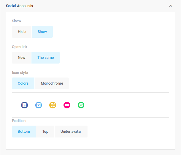
Social Accounts
- Show – Click Show to display links to the author’s social network accounts.
- Open link – Click New if you want the author’s social accounts to open in a new tab, or click The Same if you want them to open in the same tab.
- Icon Style – Click Colors if you want the social account icons to display in color, and click Monochrome if you want them to display in black and white.
- Position – Click Bottom, Top or Under avatar to indicate where you want the social icons to appear within the author box.
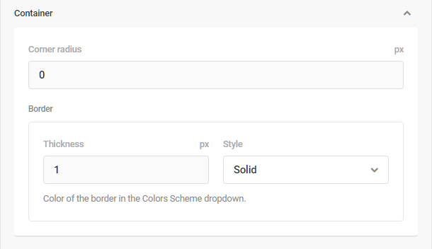
Container
Adjust the corner radius, border thickness and border style of the author box.
Colors
Click the arrow next to any element to reveal the customization options for that element.
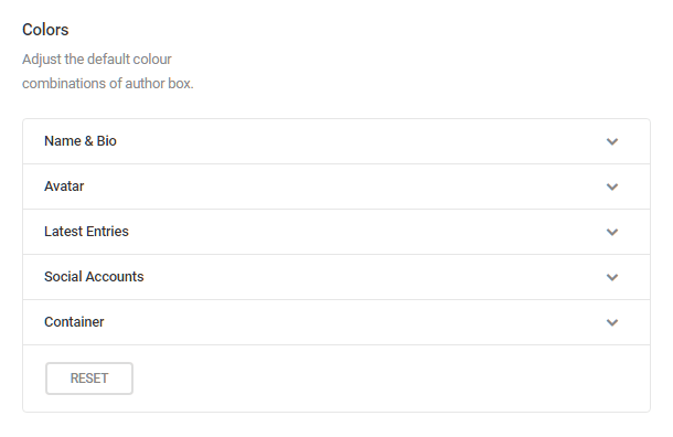
Use the color pickers to adjust the available color combinations for each element. Click Reset at the bottom of this section to return the color combinations to their default state.
- Name and Bio – Click the color swatches to open the color pickers, and choose the color you want applied to the author’s name and bio text. You can also enter the Hex Color Code in the field provided. Click Select to confirm your choice.
- Avatar – Click the color swatches to open the color picker, and choose the color you want applied to the border surrounding the avatar. You can also enter the Hex Color Code in the field provided. Click Select to confirm your choice.
- Latest Entries – Click the color swatches to open the color picker, and choose the color you want applied to the title of the Latest Entries list, and then do the same for the text color of the entries on the list. You can also enter the Hex Color Code in the fields provided. Click Select to confirm your choice.
- Social Accounts – Click the color swatches to open the color picker, and choose the color you want applied to the title of the background of the social accounts container. If you chose to display the social account icons in monochrome, you can apply a single color to all those icons with the monochrome color picker. You can also enter the Hex Color Code in the fields provided. Click Select to confirm your choice.
- Container – Click the color swatches to open the color picker, and choose the color you want applied to the title of the author box border and background. You can also enter the Hex Color Code in the fields provided. Click Select to confirm your choice.
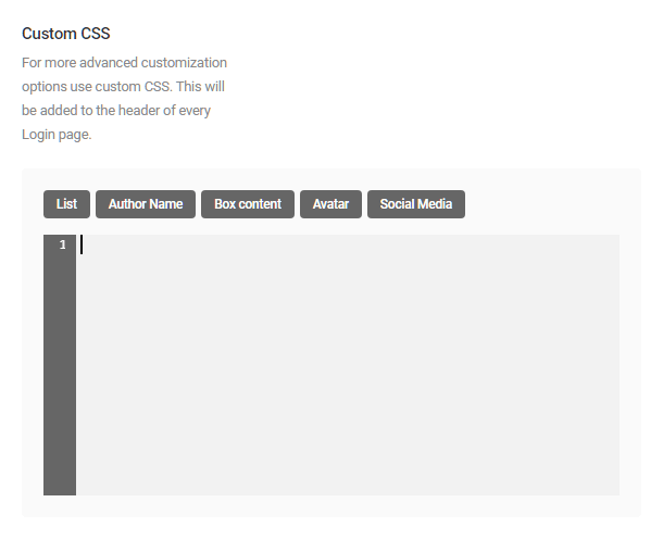
Custom CSS
For more advanced customization options use custom CSS. This will be added to the header of every Login page. You can use the preset element identifiers to ensure your customizations are properly applied.
- List – Customize the author post list if included.
- Author Name – Customize how the author name displays in the author box.
- Box Content – Customize the author box container.
- Avatar – Customize the author’s avatar.
- Social Media – Customize the container in which the social account icons display.
7.4.9 Blog Description (Multisite Only)
Link to chapter 4This module allows new bloggers to set their site tagline when they create a new blog in your multisite. Click Activate to proceed.

There are no options for this module. Once activated, it simply adds a new field to your signup form where users can brand their site with their own tagline during the signup process.

7.4.10 Document
Link to chapter 4The Document module allows you to add custom content that appears at the beginning and/or the end of content on every page or post and to modify the appearance and behavior of image galleries on your site. Click Activate to proceed.

Custom Entry Content (Before and/or After)
Click the arrow to the right of the Before and After content options, and click the Enable button to open the editor. Create the custom content you wish to appear before and/or after your page content, and click the Save Changes button.

Your Before and After Content might look something like this.
Password Protected
Change the title appearance, message and password form labels for password-protected content.
Title
Click the arrow to the right of the Title option to reveal options for the page title of password-protected content.
- Default – Preserves the default content title format.
- Clear – Removes the default “Protected” message from the content title.
- Custom – Enables you to customize the title format.
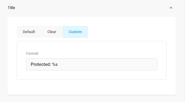
Form
Click the arrow to the right of the Form option to reveal options for the password entry form that appears on password-protected content.
- Default – Preserves the format of the password entry form.
- Custom – Enables you to customize the message, password field title and button text.
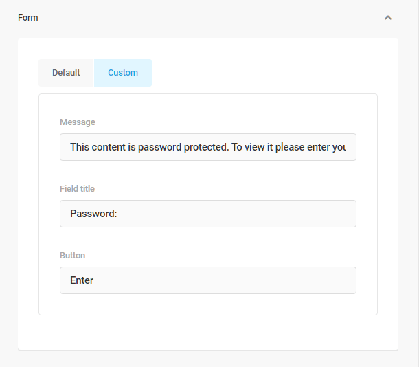
Shortcode (Gallery)
This feature allows you to standardize the image gallery shortcode for every site in your network. These settings will override any shortcode created by local site admins.
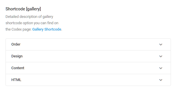
Order
Open the Order settings panel by clicking the arrow to the right. These settings will affect how image gallery thumbnails are displayed.
Sort by
- Do not change – Image gallery thumbnails will be sorted based on the settings applied by local site admins.
- Images order set in gallery tab – Sorts images using the default WordPress gallery setting.
- Title – Sorts gallery images alphanumerically by title.
- Date/Time – Sorts gallery images by the time and date stamp.
- Randomly – Gallery images display in random order.
- ID of Image – Sorts images using their Image ID numbers.
Sort Order
- Do not change – Image gallery thumbnails will be ordered based on the settings applied by local site admins.
- Ascendant – Image gallery thumbnails are displayed in ascendant order. This is the default WordPress setting.
- Descendant – Image gallery thumbnails are displayed in descendant order.

Design
Enter the number of columns in which images will be displayed, and choose the size of those images. Note that in single site installs, any image thumbnail sizes created by your theme or active plugins will also appear here.
- Do not change – Displays images in the sizes set by local site admins.
- Thumbnail – 150px square. This is the default WordPress setting for gallery images.
- Medium – 300px square
- Large – 1024px square
- Full – Images appear at the size they were when uploaded.
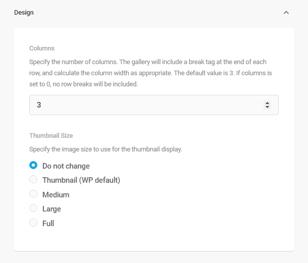
Content
Here, you can set the default for where image thumbnails in galleries should link to.
- Do not change – Uses the link set by local site admins.
- Attachment page (WP default) – Links to the attachment’s permalink
- Link directly to image file – Will open the image at the File URL as shown in the media library.
- No link – Will disable all links in gallery images.
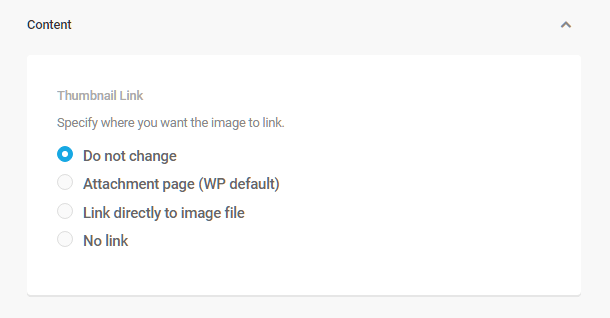
HTML
Click the arrow to the right of the HTML option to customize the tags used to enclose your gallery images, thumbnails and captions. This changes how images are displayed and whether they are accompanied with icons and captions. The default WordPress tags are:
- dl – itemtag
- dt – icontag
- dd – captiontag

7.5 Utilities
Copy chapter anchor to clipboardBranda Utilities modules allow you to control comments, blacklist or whitelist IPs, add tracking codes, override image upload filesize limits, and brand any site within your network with your own favicon. The Website Mode module allows you to create custom Coming Soon and Maintenance pages.
7.5.1 Images
Link to chapter 5The Images module allows you to override the favicon defined on individual sites in your network, replacing it with a favicon of your choosing and also to override the default image filesize limit for some users. Click Activate to proceed.
Our blog post, How To Ace Google’s Image Page Speed Recommendations With Smush, focuses on Smush features that directly impact your Google Page Speed score.
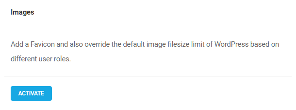
Favicon
If you wish to override the favicon defined in the WordPress customizer, use the image uploader to add the preferred favicon, and then click the Override button. Click the X to the right of the image if you want to change or delete the uploaded image.
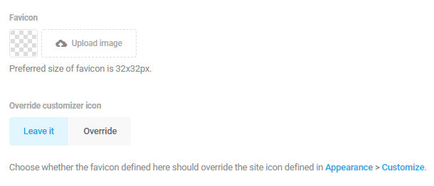
Multisite Favicons (Multisite only)
Use the Main Site image uploader to add a favicon for your main site. To use that same favicon on all the subsites in your network, click the Main Site’s Favicon button beneath the Subsites label.
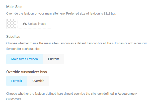
To add custom favicons for each site, click the Custom button, and type the name of the subsite into the field provided. Click the Add button, and use the image uploader to add a custom favicon for that site.
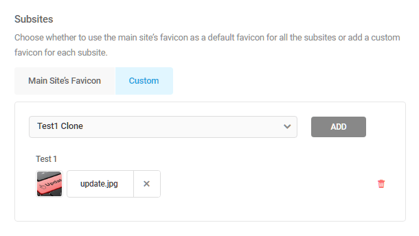
In this way, you can add a custom favicon for each site in your network. Delete a favicon by clicking the trash symbol on the right.
Image Filesize Limit
Click the Override upload limit button. You can now set your own limit on the upload size of images. For each user type, edit the numeric value field on the left, and choose a unit of measurement (b, Kb, Mb) from the menu on the right.

7.5.2 Site Generator
Link to chapter 5The Site Generator module allows you to change the generator information and link from WordPress that appears in your site’s source code to your own brand or whatever you prefer. Click Activate to proceed.

In the fields provided, enter the text, link, and version information you want to display instead of the default WordPress text.
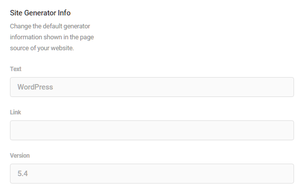
7.5.3 Text Replacement
Link to chapter 5Replace any translatable text string from your admin pages and/or front-end pages with this easy to use, find and replace-like interface. For example, you can use this tool to replace the word “WordPress” with your own website name throughout your website, even when it appears in links. You can also hide text strings that you would like to remove but not replace, by leaving the Replace with field blank. For instance, this feature could be used to hide the “Proudly powered by WordPress” footer on your website. Click Activate to proceed.
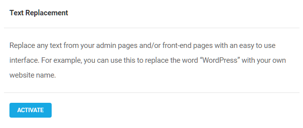
This tool can only replace text strings that have been internationalized (made translatable) in your plugins & themes. For example, it can replace text strings in a form plugin’s submit buttons, or post meta output by your theme (Author, Date, etc), if they have been internationalized, but it cannot replace text in post titles & content.
Each text string that you wish to replace requires a rule, and you can create as many rules as you need. The first time you access the Utilities module, you will be prompted to add a rule. Create a rule by clicking the Add Rule button.
- Find Text – Enter the text you wish to be replaced.
- Replace with – Enter the text you wish to appear in place of the the text entered in the Find Text field. Alternatively, you can leave this blank to simply hide the text specified in the Find Text field.
- Text domain – If you want to target text from only a specific plugin or theme, enter the text domain identifier in the “Text domain” field. Below the text domain field is a link to the WordPress codex file on that subject.
- Scope – Determines what pages will be affected by the rule. Apply the rule to All Pages, Admin Pages or Front-end Pages, by clicking the corresponding button.
- Case matching – Apply case sensitivity to your rule by clicking the Case Insensitive and Case Sensitive button as needed.
- Link Text – If the rule you are creating is intended to change link text, click the Include button. Replacing link text with this Text Replacement tool will not interfere with the link’s functionality.
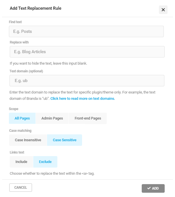
To edit any existing rule you have added, click the pencil icon in that rule’s row. Click the trash icon to delete a rule. You can also bulk delete rules using the Bulk Actions option at top-left.

7.5.4 Website Mode
Link to chapter 5The Website Mode module creates quick and easy Coming Soon and Maintenance Mode pages. The tool is designed to create a Coming Soon page for sites that are under construction, or a Maintenance Mode page that can be activated during periods when a site is offline for any reason. The pages cannot be active simultaneously. Click Activate to proceed.
Any user agent that reaches your site with Maintenance Mode enabled would receive a 503 Service Unavailable response, while the Coming Soon mode would return a 200 OK response.
Configuration
Click the Coming Soon or Maintenance button, depending on the type of page you wish to create.
If you’re working within a multisite network, you’ll have additional options to select where to display your page. Click the All Sites button to display the page for every site in the network. Click the Selected Sites button to apply the page to only specific sites. Enter the name of a subsite you wish to add to the list, and click Add. Repeat the process for every subsite you wish to add to the list.
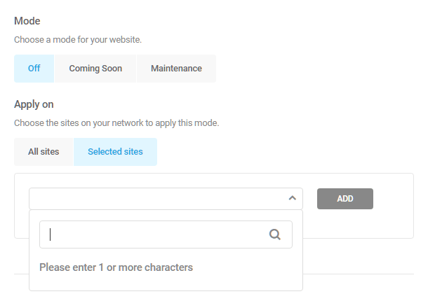
Content
Logo & Background
If you wish to add a logo or background image to the page, click the arrow to the right of “Logo and Background” to reveal a configuration panel. The configuration here is identical to that in the DB Error Page module.
Display Message
Click the arrow next to “Display Message”, and use the post-type editor to create the custom message you wish to display on your coming soon or maintenance mode screen.
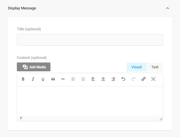
Countdown Timer
If you wish to display a countdown timer on the page, click the arrow next to “Countdown Timer”, then click the Show button. Enter a “Till Date” and “Till Time”, and the page will be disabled at that time, displaying your intended landing pages instead.
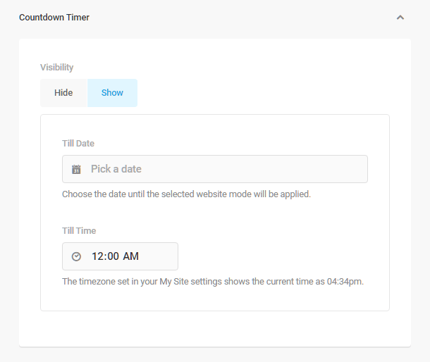
Social Accounts
To add social network sites to your Coming Soon or Maintenance page, click the arrow next to “Social Accounts”, and then click the Add Accounts button. The configuration here is identical to that in the DB Error Page module.
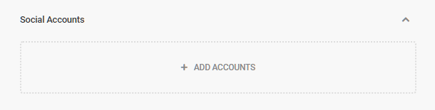
Design
Logo
Click the dropdown arrow to the right of Logo to customize that element’s display properties. Use the fields provided to set the width, opacity, position on the screen, margins and corner radius. The configuration here is identical to that in the DB Error Page module.
DB Error Page module.

Countdown Timer
Click the arrow next to “Countdown Timer” to choose the style of the countdown timer displayed on your page.

Social Accounts
Click the arrow next to “Social Accounts” to reveal the configuration panel. The configuration here is identical to that in the DB Error Page module.

Content Wrapper
Click the arrow next to “Content Wrapper” to modify the width and corner radius of the content wrapper displayed on your Coming Soon or Maintenance page.

Colors
Logo & Background
Click the color swatches to open the color pickers, and choose the colors you want applied to the logo and background. You can also enter the Hex Color Code in the field provided. Click Select to confirm your choice.
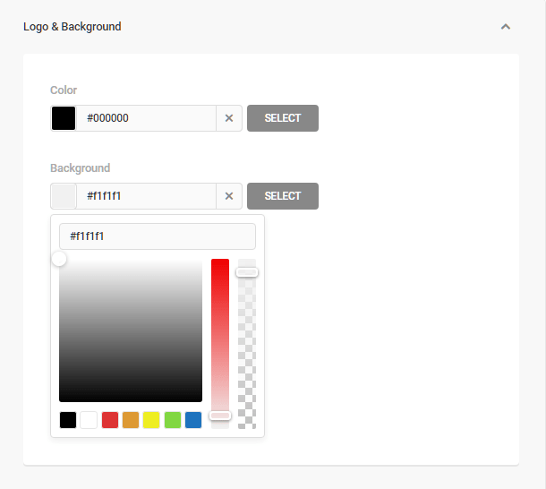
Display Message
Click the color swatches to open the color pickers, and choose the colors you want applied to the title and error message text. You can also enter the Hex Color Code in the field provided.
Content Wrapper
Click the color swatch to open the color picker, and choose the color want applied to the background of your website mode page. You can also enter the Hex Color Code in the field provided.
Custom CSS
Use the CSS editor to apply advanced customization to your Coming Soon or Maintenance page. CSS applied here will only affect these two pages. Preset selector buttons are provided for each customizable area.
- Overall – Apply CSS to both the Coming Soon and Maintenance pages.
- Page – Apply CSS to a specific page,
- Clock – Apply CSS to the Countdown Timer.
- Content – Apply CSS to the Error Message displayed on the page.
- Social Media – Apply CSS to the displayed social account icons.
- Logo – Apply CSS to the uploaded custom logo.

7.5.6 Tracking Codes
Link to chapter 5The Tracking Codes module allows you to add tracking codes to every page of your website, or add them conditionally. Click the Activate button to activate the module.
Then click the + Add Tracking Code button to add a new tracking code to your site.
As an Editor or Administrator of your site (or Super-Administrator of a multisite), your user role has the built-in WordPress unfiltered_html capability. This means that you can add full JS tracking scripts from any provider. However, if you grant access to Branda to user roles lower than Editor in the Permissions settings, they will only be able to add the tracking ID or token from a selected provider. See also Additional Filters below.
Note that any tracking codes that you had saved in a previous plugin version using <script> tags will continue to work so you don’t lose any tracking data.
General Tab
Administrator or Editor User Roles
- Status – Click the Inactive/Active button to enable or disable a tracking code as needed.
- Name – Enter a name for this tracking code so you can easily identify it from the list.
- Tracking Code – Paste the full tracking code script from any provider in this field.
Other User Roles
- Status – Click the Inactive/Active button to enable or disable a tracking code as needed.
- Provider – Select the desired tracking code provider from the list. Currently available providers are Google Tag, Facebook Pixel, MS Clarity, Cloudflare Analytics or PIWIK Pro.
- Name – Enter a name for this tracking code so you can easily identify it from the list.
- Container URL & Site ID – For PIWIK Pro only; enter the needed info in the corresponding fields.
- ID or Token – Enter the tracking ID or Token for any other selected provider.
Location Tab
Insert Position (Editor & Administrator roles only)
- Select the location where the tracking code should be output on your pages: Inside <head>, After <body> or Before </body>. Note that code added by any other user role will be added Inside <head> by default.
Location Filters (all user roles)
- Users – Click the User field, and select the user roles and/or user status for which this code will apply. You can apply multiple filters for each code insertion.
- Authors – Click the Authors field to choose a specific user/author for which this code will apply. This filter will apply only on single entry post types from that user/author.
- Content Type – Click the Content field to choose the content types for which this code will apply. You can apply multiple content types for each code insertion.
Additional Filters
If you prefer to remove the ability to add full JS tracking scripts for Editor and Administrator users, and force the provider selection dropdown, you can use the following filter in your child-theme’s functions.php file or in a mu-plugin.
add_filter( 'branda_allow_unfiltered_html_actions', '__return_false' );
7.6 Widgets
Copy chapter anchor to clipboardBranda Widget modules allow you to customize the default WordPress dashboard widgets or add custom feeds to the WordPress dashboard, and to customize the front end Meta widget to match your branding. Click Activate to proceed.
7.6.1 Dashboard Widgets
Link to chapter 6The Dashboard Widgets module allows you to replace the default WordPress dashboard widgets with your own custom content and to create a custom dashboard welcome message, Click Activate to proceed.
Widget Visibility
Choose the widgets which you want to remove from all the dashboards on your site or network by clicking the corresponding checkboxes. Note that any feeds you added in the Dashboard Feeds module will appear here, along with any custom Text widgets you create below, as well as the default WordPress widgets.
Dashboard Welcome
You can customize the default WordPress welcome message that appears to new users by adding your own message, images, and links.
Use the post-type editor to customize the welcome message. First, choose whether you want to allow shortcode parsing within the welcome message or not; but be careful, as it can break compatibility with themes with UI builders.
Text Widgets
Add text widgets with your custom content to the WordPress dashboard by clicking the Add Text Widget button.
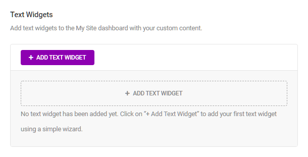
Craft your message using the post-type editor.

7.6.2 Dashboard Feeds
Link to chapter 6The Dashboard Feeds module enables you to create your own feed widgets for your WordPress dashboard. Click Activate to proceed.

When entering the Dashboard Feed module for the first time you will be prompted to create your first feed. Click the Add Feed button to proceed.
Add Dashboard Feed
The Add Dashboard Feed panel contains three tabs, General, Display, and Visibility. Adjust the options under each tab as needed, then click the Add button to add the feed to your dashboard.
General
- Site URL – Enter the main URL of the site whose feed you want to use.
- Feed title (optional) – Enter the feed title that will appear at the top of your feed widget.
- Feed URL – Enter the URL of the feed itself here.
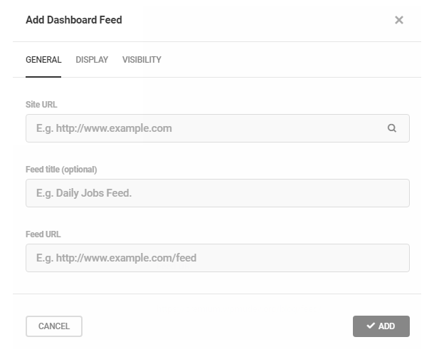
Display
- Count – Enter the number of items you want to display from the feed.
- Content – Select Excerpt or Full Content to determine how much of any feed item to display.
- Author – Select to Hide or Show the display of author names.
- Date – Select to Hide or Show the creation date of feed items.

Visibility
- Dashboard – Click the Hide/Show buttons to control whether a feed is displayed on the dashboard of a single site or on the dashboards of every site in a network.

Here’s an example of a Custom Feed as it appears on the dashboard.

7.6.3 Meta Widget
Link to chapter 6Use the custom meta widget module to rebrand the default meta widget on your site or all multisite blogs with one that has the “Powered By” link branded for your site. Click Activate to proceed.
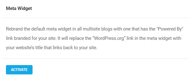
Once activated, the Meta Widget module will automatically replace the “WordPress.org” link in the meta widget with your website’s title that links back to your site. Deactivate the module to return the Meta Widget to its default state.
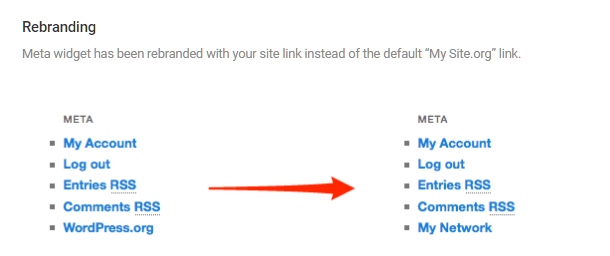
7.7 Settings
Copy chapter anchor to clipboardBranda Settings include accessibility, data preservation, and import/export functions.
7.7.1 Data
Link to chapter 7The Data tools control how your Branda settings and other data are handled when you export or uninstall the plugin. Settings refer to the module configurations, while Data includes transient bits created over time, such as logs, frequently used modules, last import/export time, and other pieces of information.
Uninstallation
In the event you want to uninstall Branda, but may want to reinstall it at a later time, click the Preserve button to save your configurations, so they may be quickly reapplied when you reinstall the plugin. If you wish to reset all configurations to their default state, click the Reset button.
Branda creates logs, frequently used modules data, last import/export time, and other pieces of information that you may find useful. Click the Keep button if you wish to preserve this data when you uninstall the plugin, or click the Remove button if you don’t want the data preserved.
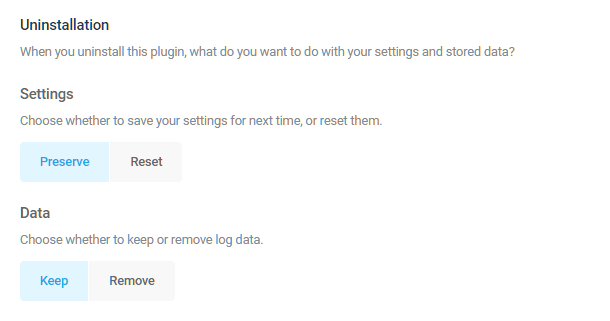
Multisite admins should note that the above options only affect the main site’s data. Click the Delete Subsites Data button to delete network subsite data before uninstalling the plugin.
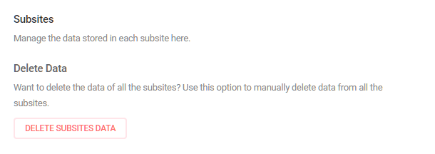
Reset
Click the Reset button to return all modules to their default state, without eliminating any data generated since the original installation or last reset.

7.7.2 Permissions
Link to chapter 7User Permissions
- User Roles – Select the user roles who can access and configure Branda options and settings.
- Custom Users – Add any specific users who can access and configure Branda options. Note this overrides the above user role settings.

Subsite Controls (Multisite Only)
In multisite installs, you can select whether subsite admins can override Branda settings or not.
- None – Subsite admins can’t override any module settings and will always inherit your network settings.
- All – Subsite admins can override any default module settings set in your network settings.
- Custom – Select the modules that subsite admins can override on their subsites.
Note that any module you allow to be overridden here must also be active in order for it to appear in subsite admin areas. Click the Manage All Modules button at the top-right of any Branda screen to double-check if you’re not sure.

7.7.3 Accessibility
Link to chapter 7Click Enable High Contrast Mode to increase the visibility and accessibility of Branda elements and components to meet WCAG AAA requirements. When enabled, High Contrast Mode only effects elements within the Branda UI.
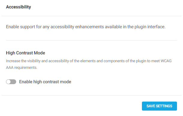
High Contrast Mode adds a black fill to some elements to improve their visibility.

7.7.4 Export
Link to chapter 7The Export tool allows you to export your Branda configurations into a JSON file to apply to another website. Click the Include debug info if you want to include debug information in the export file. Click the Export button to create the JSON file.

7.7.5 Import
Link to chapter 7The import tool allows you to upload a JSON file and import Branda settings from another website. Use the file uploader to load the JSON file, and click the Import button to apply the setting to the Branda plugin installed elsewhere.
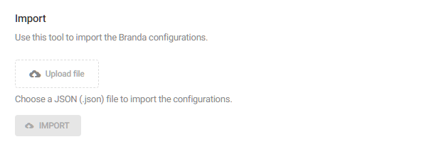
7.8 White Label WPMU DEV Plugins
Copy chapter anchor to clipboardWPMU DEV gives you the option to remove/replace branding in WPMU DEV plugins. Add a custom logo, remove the WPMU DEV documentation button and the default WPMU DEV footer text, where you can replace our text with yours.
This is all managed from the White Label section of the WPMU DEV Dashboard plugin.
For more information and a look at configuration options for white labeling your plugins, visit the WPMU DEV Dashboard plugin documentation.
Check out our complete suite of white label features including white label analytics in the WPMU DEV Dashboard plugin and custom client and developer reports in the Hub.
7.9 Get Support
Copy chapter anchor to clipboardIf you still have questions or need assistance after reading this document, please don’t hesitate to contact our support superheroes using the available options under the Support tab in your Hub or via the Support tab in your WPMU DEV Dashboard.


7.5.5 Comments Control
Link to chapter 5The Comments Control module allows you to disable the comments on posts, pages or on your entire website. You can also whitelist IPs for which comments will not be throttled, or blacklist IPs to disable commenting globally from them. Click Activate to proceed.
Comments
IP Whitelist
To whitelist an IP, enter the IP address into the whitelist field, one IP per line. Both IPv4 and IPv6 are supported.